Customizing Products Display
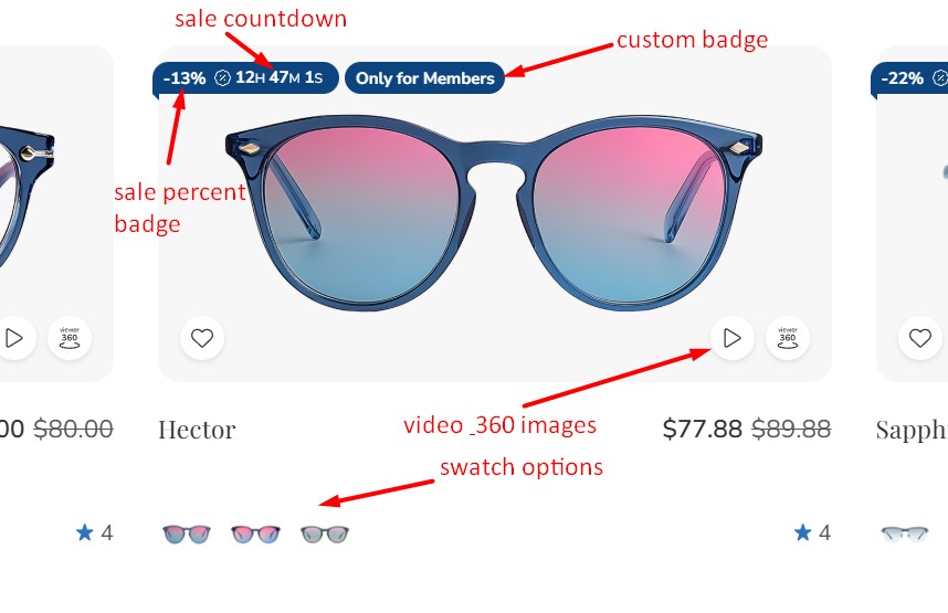
Product Card
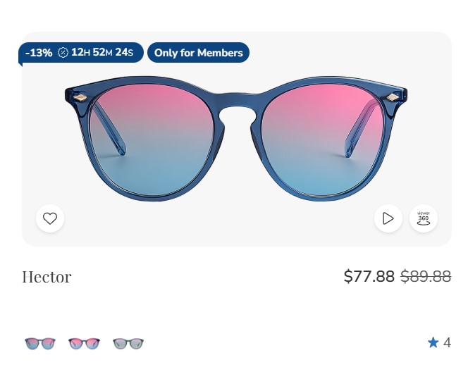 |
 |
 |
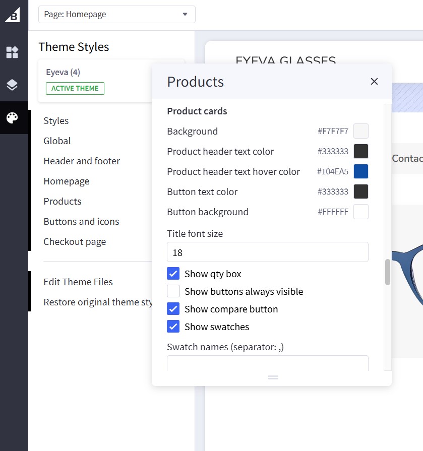
Configure the display of product cards under Page Builder > Theme Styles > Products > Product Cards:
| Setting | Value & Meaning |
|---|---|
| Product Cards | |
| Background | #F7F7F7 Defines the background color of the product cards. |
| Product header text color | #333333 The main color used for product headings (e.g., product name/title). |
| Product header text hover color | #104EA5 The color applied to product headings when hovered over by the mouse. |
| Button text color | #333333 The color of text on product card buttons (e.g., “Add to Cart,” “View Details”). |
| Button background | #FFFFFF The background color for product card buttons. |
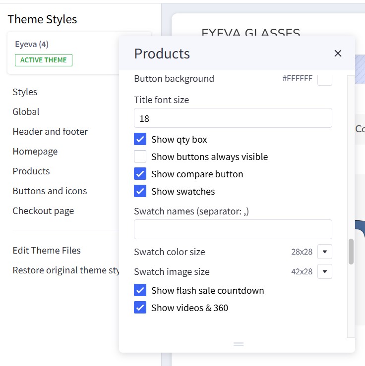
| Title font size | 18 (px) Font size for the product heading/title. |
| Show qty box | Checked Displays a quantity selector on the product cards (so customers can choose a specific quantity before adding to cart). |
| Show buttons always visible | Unchecked When off, product buttons appear on hover. If turned on, the buttons are displayed at all times. |
| Show compare button | Checked Displays a “Compare” button, allowing customers to compare products. |
| Show swatches | Checked Shows color or image swatches on product cards for variants (e.g., different color options). |
| Swatch names (separator: , ) | (blank) If you enter text here, swatch names will be displayed alongside swatches, separated by the comma character(s). |
| Swatch color size | 28x28 Specifies the width and height (in px) for color swatches. |
| Swatch image size | 42x28 Specifies the width and height (in px) for image swatches. |
| Show flash sale countdown | Checked Shows a countdown timer if a product is on flash sale (limited-time pricing). |
| Show videos & 360 | Checked Enables display of product videos or 360° spin images if available. |
| Show video from custom field __@card_video when hovering product card | Unchecked Enables video playback when hovering over product card images. Requires products to have a __@card_video custom field with video URL. |
Notes:
- All color codes are in hexadecimal format.
- Font sizes are typically measured in px unless otherwise specified.
- Checked boxes are enabled, unchecked boxes are disabled by default.
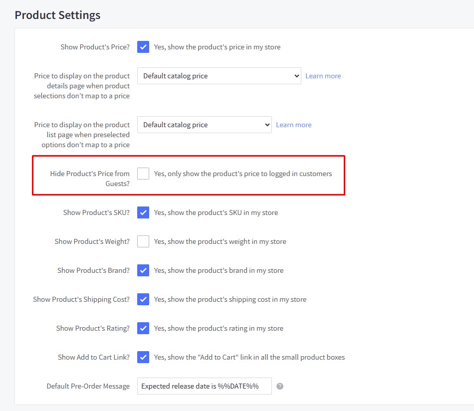
Hiding Prices for Non-Logged-In Customers
To enable this feature, go to Settings > Display > Products Settings and check the Hide Product's Price from Guests? checkbox.
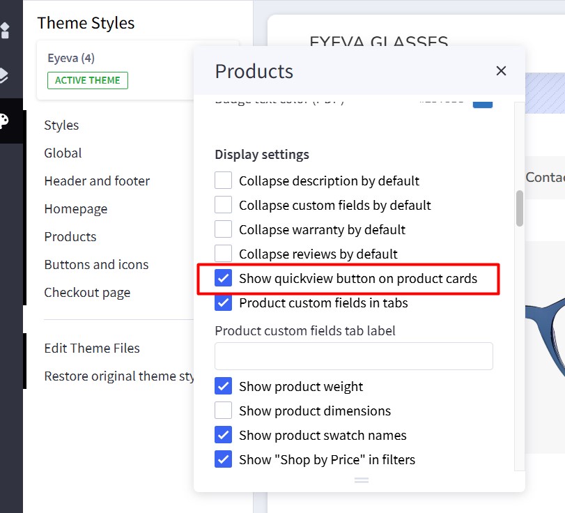
Showing/Hiding Quick View Button
By default, quick view buttons appear on all product cards. To hide them, go to Page Builder > Theme Styles > Products > Display Settings and uncheck the Show quick view button on product cards checkbox.
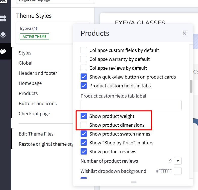
Displaying Product Weight and Dimensions on PDP
Go to Page Builder > Theme Styles > Products > Display Settings.
- Check the Show product weight checkbox.
- Check the Show product dimensions checkbox.
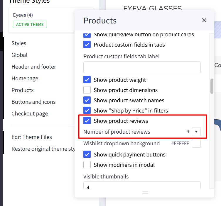
Displaying Customer Reviews Tab on PDP
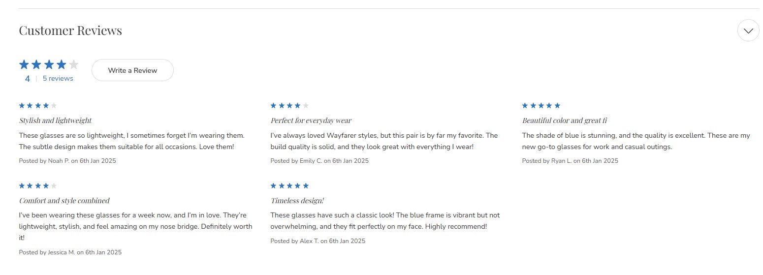
Go to Page Builder > Theme Styles > Products > Display Settings and check the Show product reviews option.
Specify the number of product reviews to be displayed.
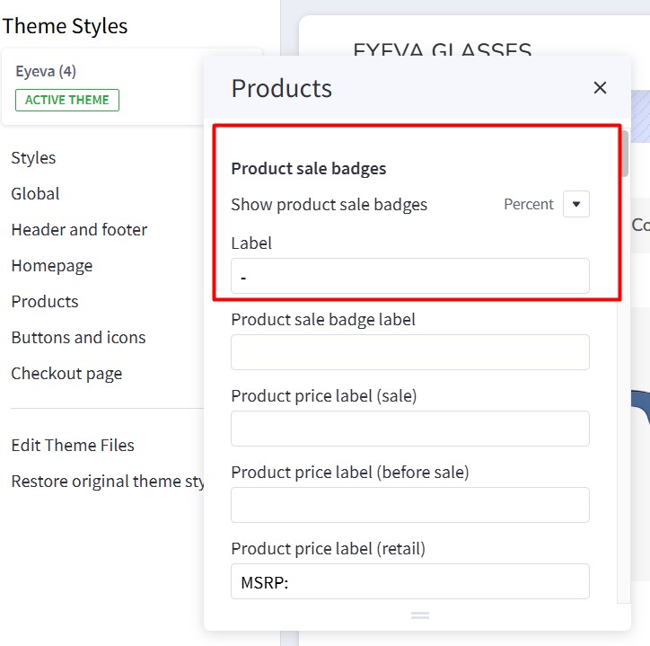
Display Sale Badges on PDP
Go to Page Builder > Theme Styles > Products > Product Sale Badges. In Show product sale badges, select the badge type:
Percent: Displays the badge label with the percentage off.Label: Displays only the label.None: Hides the badge.
 |
 |
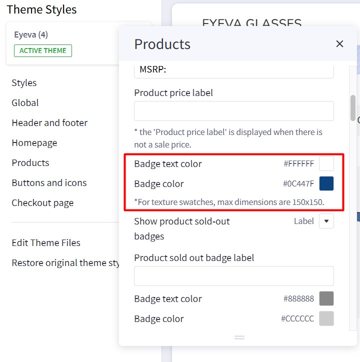
- Label: Specifies the badge text.
- Badge text color: Specifies the badge text color.
- Badge color: Specifies the badge background color.
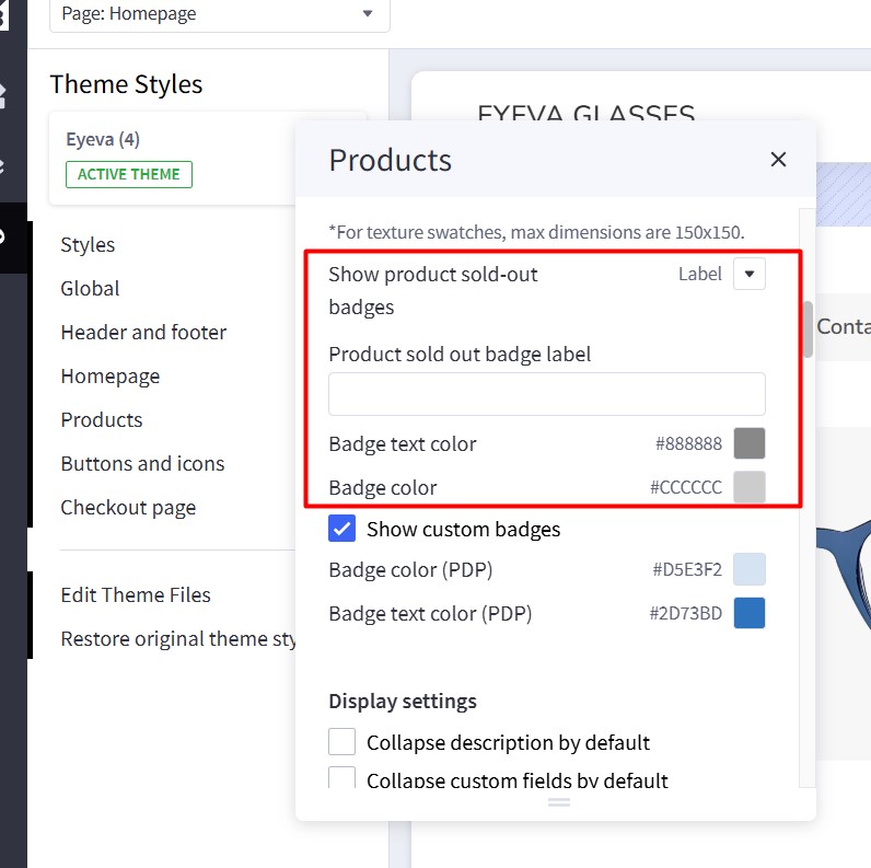
Sold Out Badge
To display a "Sold Out" badge, in Page Builder, navigate to Products and find Show product sold-out badges. Select "Label".
Enter the text to display for the sold-out badge in the Product sold out badge label field.
- Badge text color: Specifies the text color.
- Badge color: Specifies the background color.
Custom Text Badge
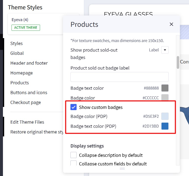
- Show custom badges: Enable to display custom badges.
- Badge color (PDP): Background color of the custom badge.
- Badge text color (PDP): Text color of the custom badge.
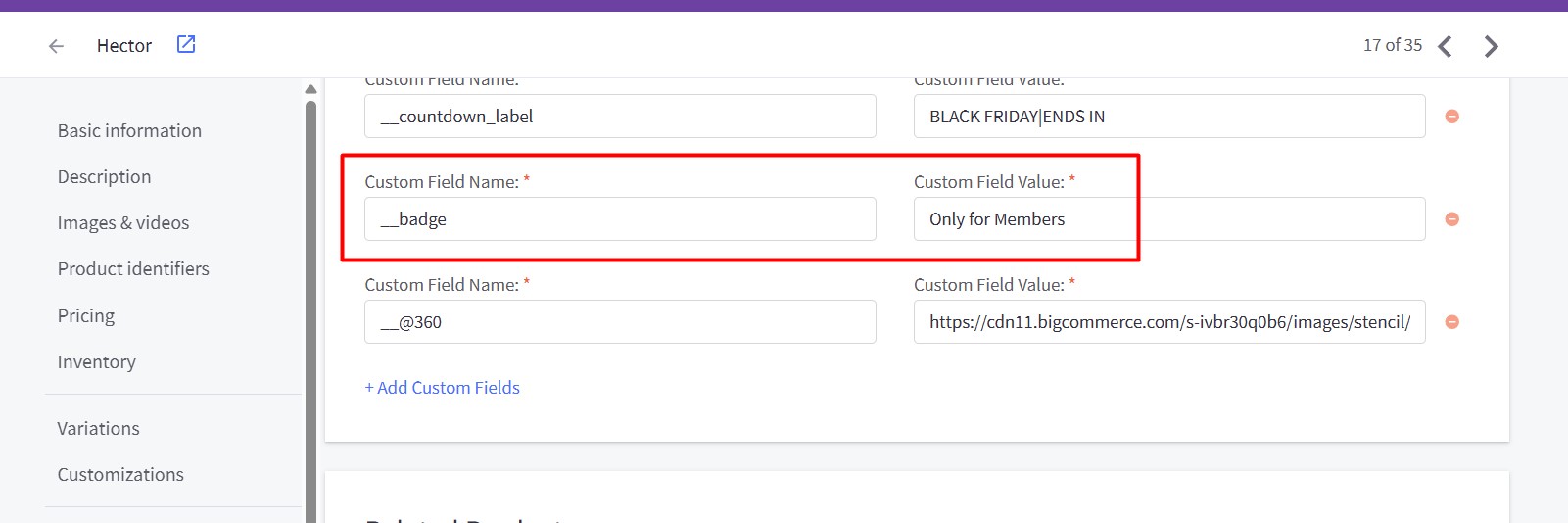
To add a custom badge to a product, edit the product and add a custom field with the name __badge. The value of this field will be the badge text.
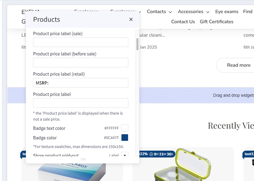
Customizing Price Labels
You can customize the sale price label, before-sale price label, retail price label, or regular price label in Page Builder > Theme Styles > Products > Price Labels.
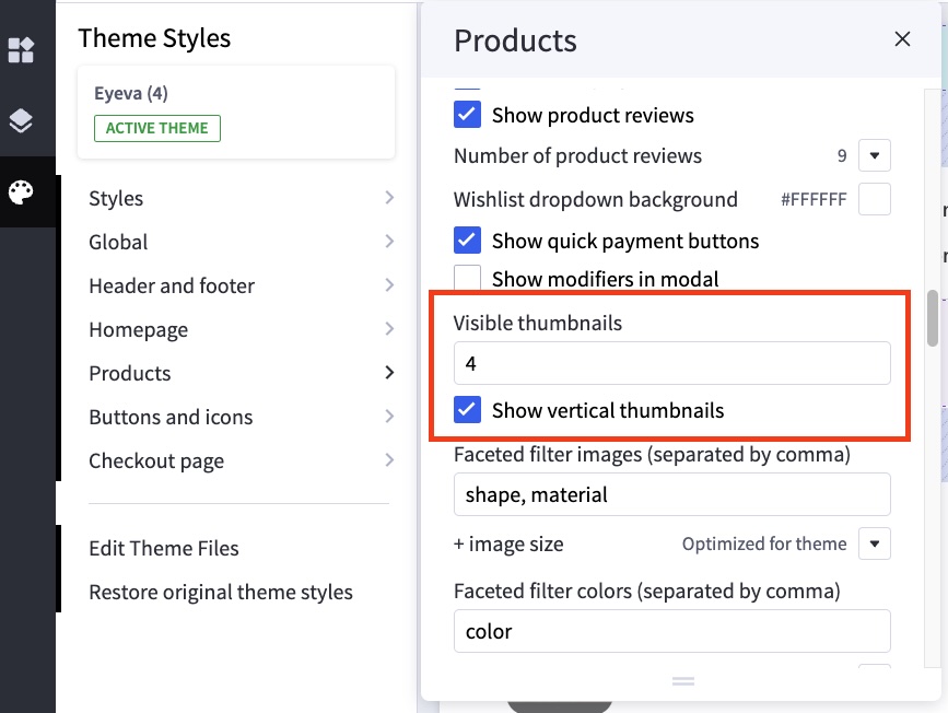
Displaying Image gallery
Configure the image gallery in Page Builder > Theme Styles > Products > Display settings:
| Setting | Value & Meaning |
|---|---|
| Visible thumbnails | 4 Specifies how many product thumbnails appear alongside the main product image. |
| Show vertical thumbnails | Checked Displays product thumbnails in a vertical layout instead of a horizontal row under the main image. |
Configuring Image Sizes
In Page Builder > Theme Styles > Products > Image Sizes, you can configure the following image sizes:
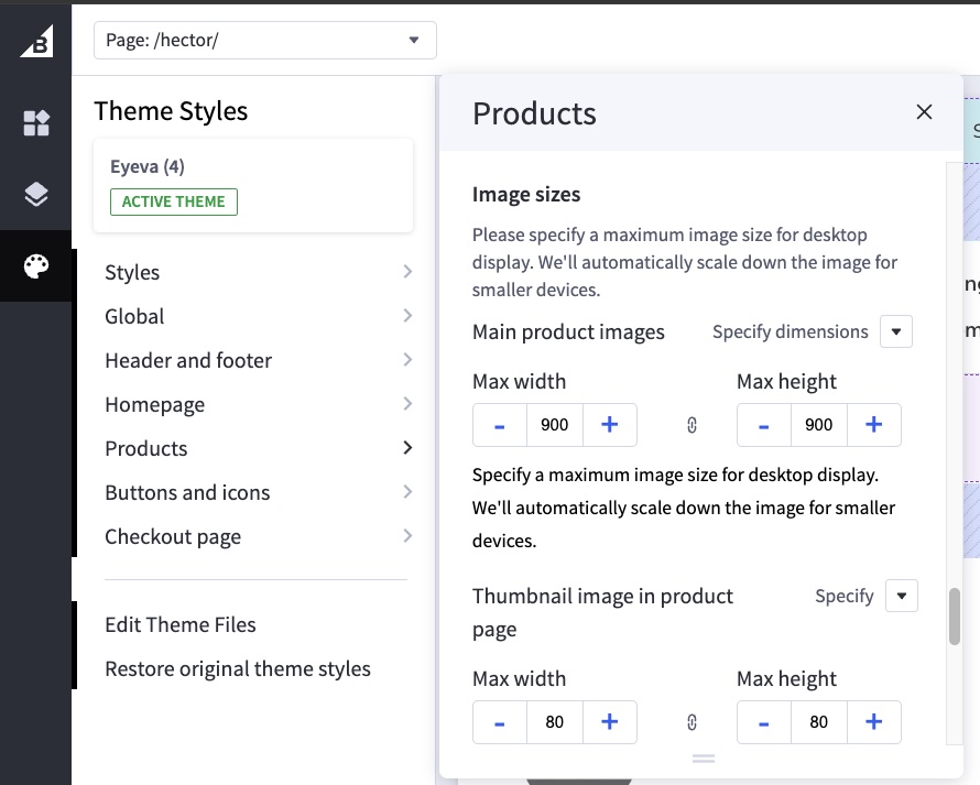
- Main product images: Specify the size of the main product image displayed on the Product Detail Page (PDP).
- Thumbnail image: Specify the size of product thumbnails.
- Zoomed image: Specify the size of the zoomed image.
- Image in gallery view: Specify the size of product card images.
Shipping Countdown
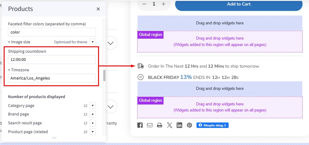
To display a shipping countdown on the Product Detail Page (PDP), navigate to Theme Styles > Product Page. Locate the Shipping Countdown field and enter your cut-off time. Find and copy your timezone from Wikipedia (https://en.wikipedia.org/wiki/List_of_tz_database_time_zones) and paste it into the Timezone field.
To disable the shipping countdown, simply leave the Shipping Countdown field empty.
Note:
- Before the cut-off time, the message will display "Shipping today"; after the cut-off time, it will display "Shipping tomorrow."
- Weekends are automatically excluded.
Default states for collapsible elements
In Page Builder > Theme Styles > Products > Display setting:
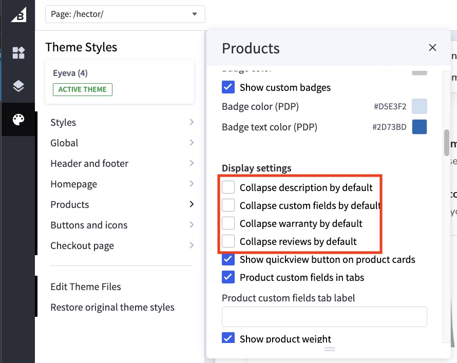
| Setting | Value & Meaning |
|---|---|
| Collapse description by default | Unchecked The product description is expanded by default (not collapsed). |
| Collapse custom fields by default | Unchecked Custom fields are expanded by default (not collapsed). |
| Collapse warranty by default | Unchecked The product warranty section is expanded by default (not collapsed). |
| Collapse reviews by default | Unchecked The reviews section is expanded by default (not collapsed). |
Displaying product custom fields
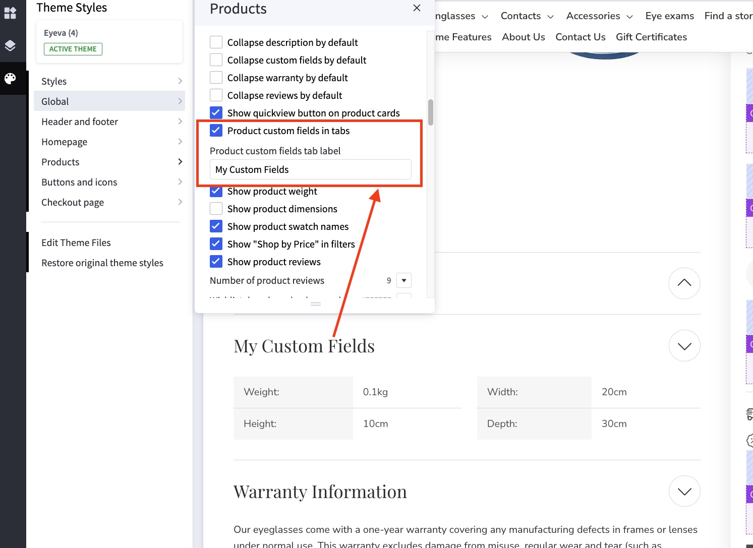
In Page Builder > Theme Styles > Products > Display setting:
- Tick Show custom fields in tab checkbox.
- Enter the tab title in the next Product custom fields tab label box.
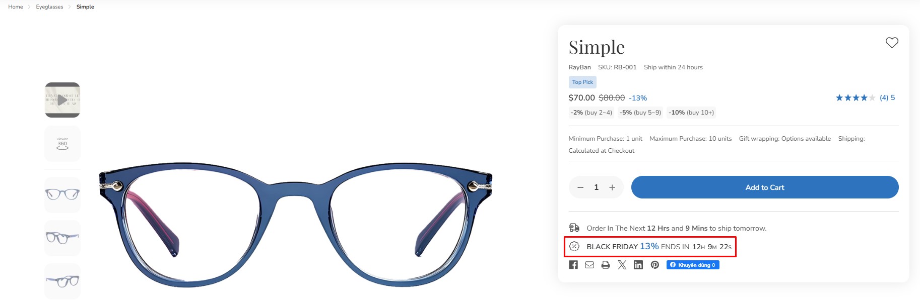
Flash Sales
On the Product Detail Page (PDP):
On the Product Card:
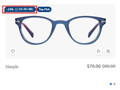
To display flash sales for a product, edit the product and:
- Add a product custom field named
__countdown_labelwith a value in the format<your banner name>|<end in>(e.g.,FLASH SALES|ENDS IN). - Add a second custom field named
__countdown_date. The value should be your cut-off time, following this format:<yyyy>-<mm>-<dd> <hh>:<mm>:<ss><timezone>(e.g.,2023-03-15 17:00:00-7).
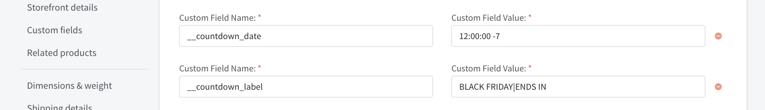
Note:
<yyyy>-<mm>-<dd>is optional. If the date is omitted, the flash sale message will repeat automatically immediately after the cut-off time passes.<hh>:<mm>:<ss>uses a 24-hour format.<timezone>should only include+or-followed by a number (e.g.,+7). If the timezone is not specified, the countdown time may vary across different countries.- The product must have a sale price for the Flash Sale to display. Removing the sale price will automatically disable the Flash Sale banner.
Display Product Modifiers in a Right-Side Modal
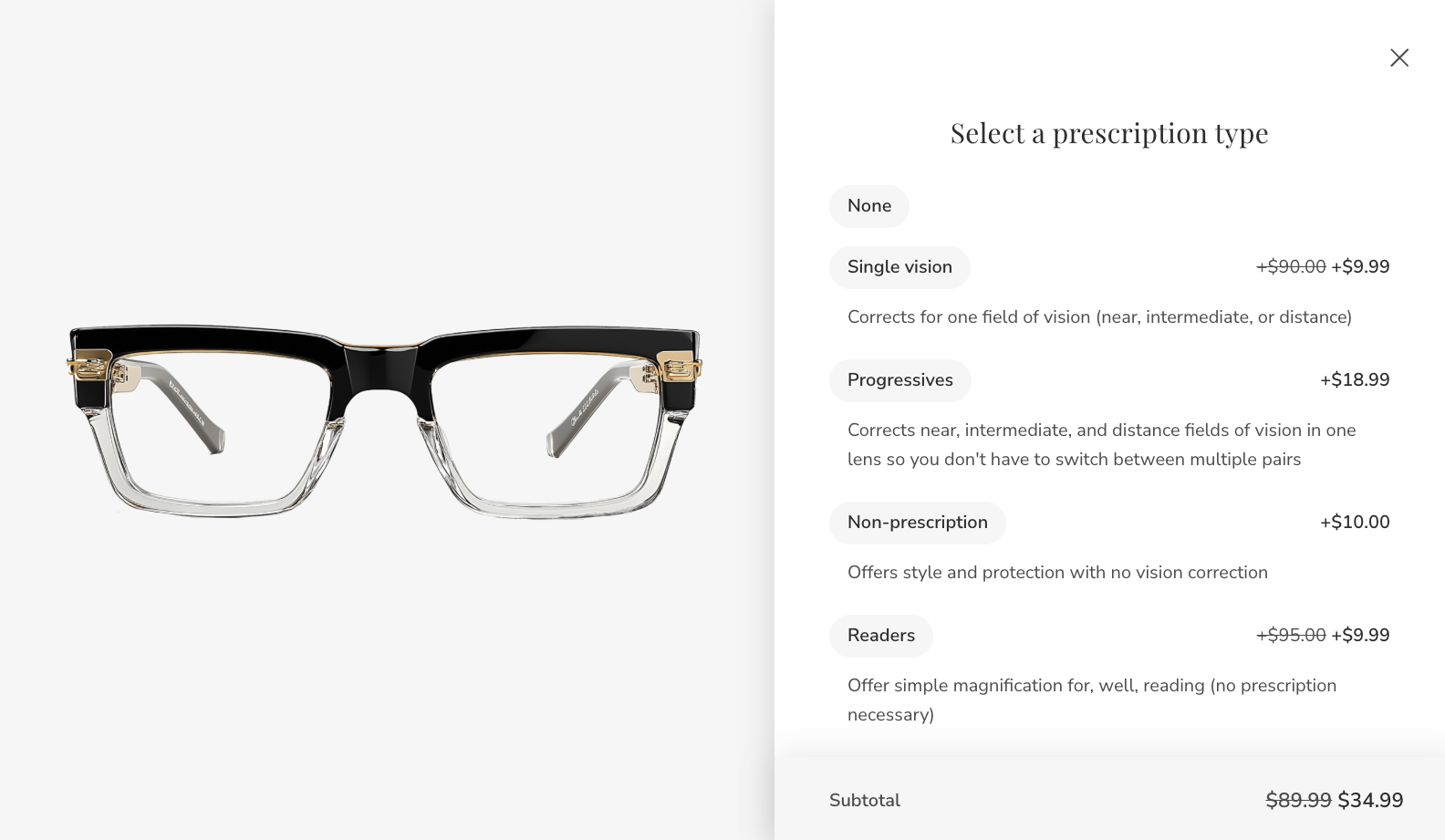
Enable Product Modifiers Modal
To enable or disable the modifiers modal for specific products, edit the product and add a custom field with the name __@modifiers_modal and set its value to 1.

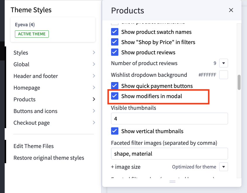
To enable the product modifiers modal for all products without adding a custom field to each, navigate to Page Builder > Products > Display Settings and enable Show modifiers in modal.
Customize the "Select Options" Button Text
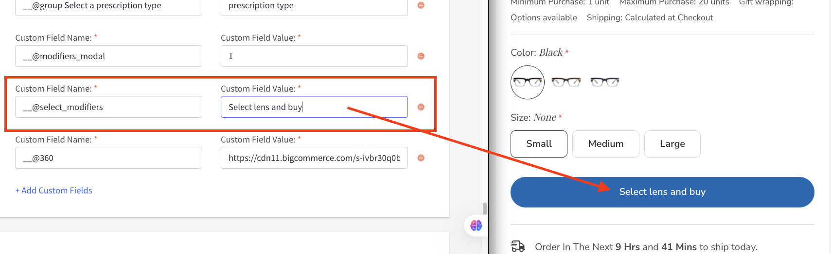
To customize the text of the "Select Options" button, add a product custom field named __@select_modifiers. Set the value of this field to the desired button text.
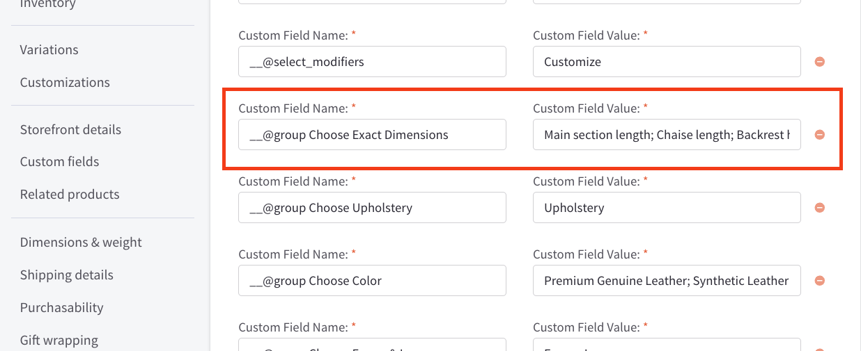
Grouping Modifier Options
By default, each modifier option is displayed step-by-step. To group multiple options into a single step within the option modal, set the Custom Field Name to __@group [title] and the Custom Field Value to a semicolon-separated list of option names you want to group together (e.g., Option Names;Option Name).
Custom field:
Result:
Customize the Modal Title of Each Modifier Option
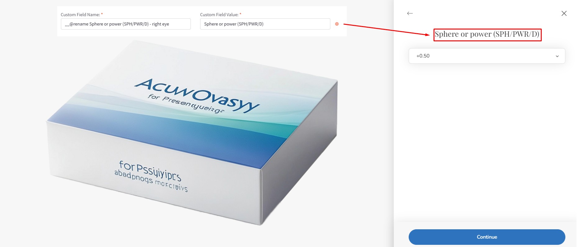
By default, the modal title mirrors the modifier option name. To customize the title of a specific modifier option within the modal, create a custom field named __@rename [title to be changed] and assign the desired new title as its value.
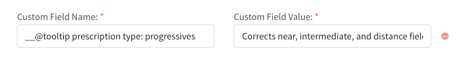
Add tooltip to Modifier Option Modal
Display tooltip for option value:
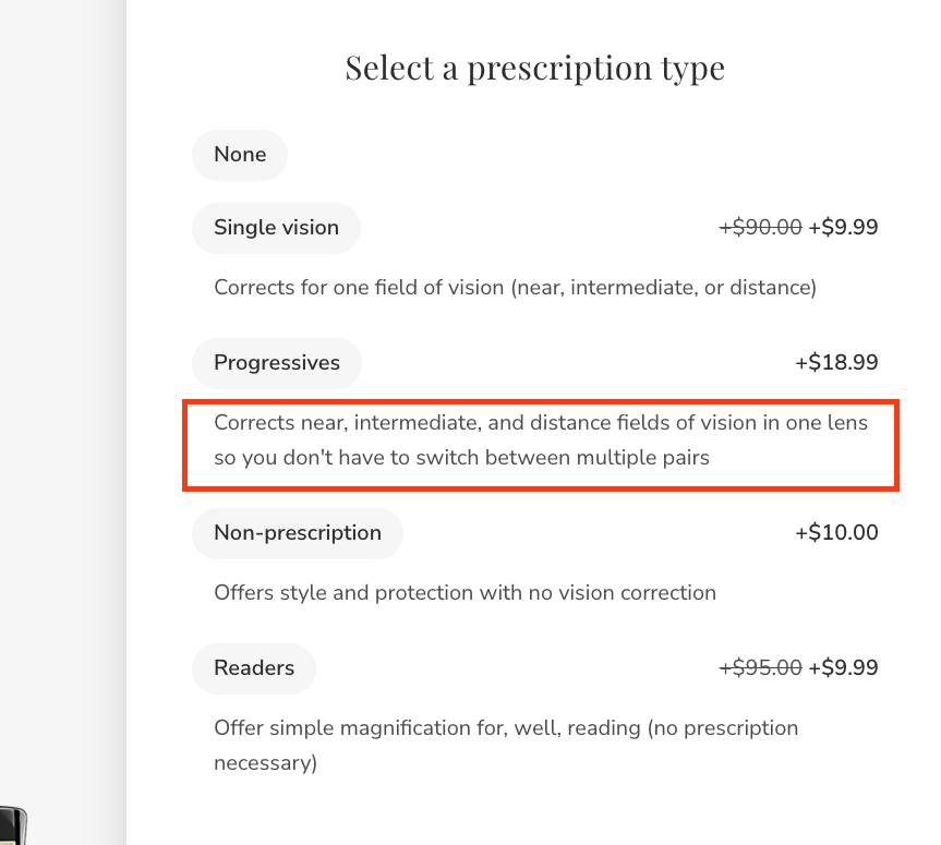
Add custom field name __@tooltip [Option Name]: [Value] and set the custom field value to the desired description of the value:
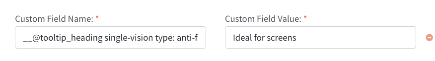
Display tooltip heading for option value:
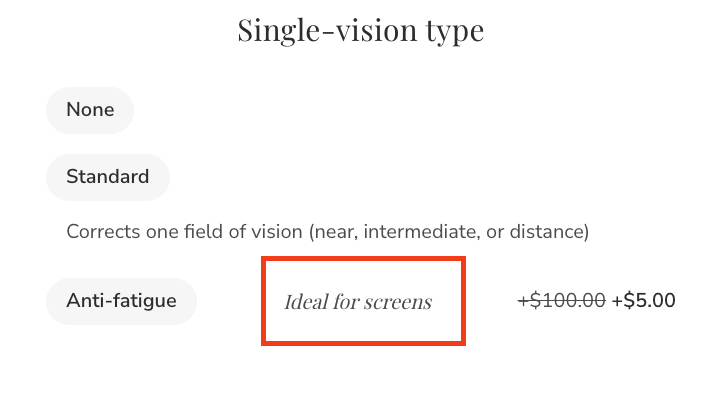
Add custom field name __@tooltip_heading [Option Name]: [Value] and set the custom field value to the desired description of the value:
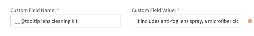
Display tooltip for option:
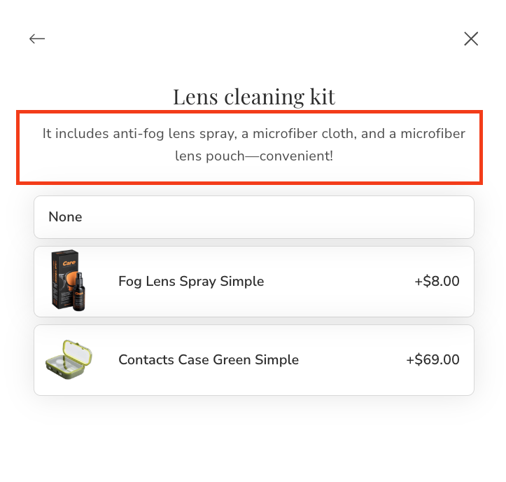
Add custom field name __@tooltip [Option Name] and set the custom field value to the desired description of the option:
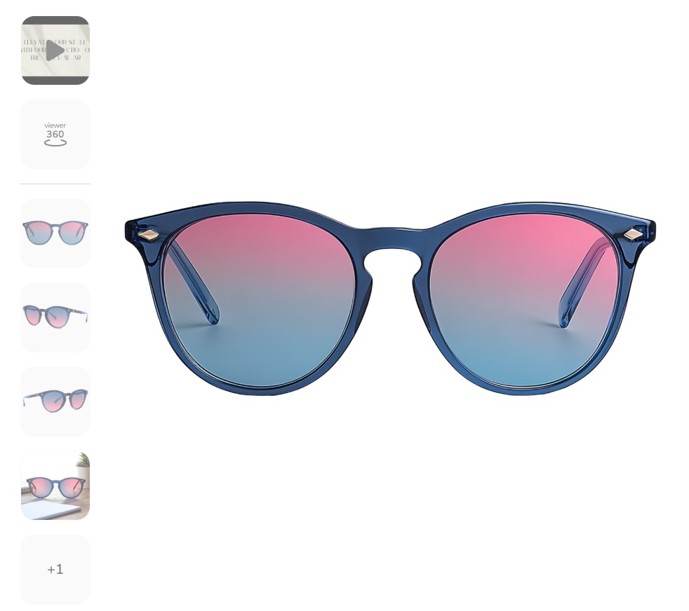
Displaying 360-Degree Images
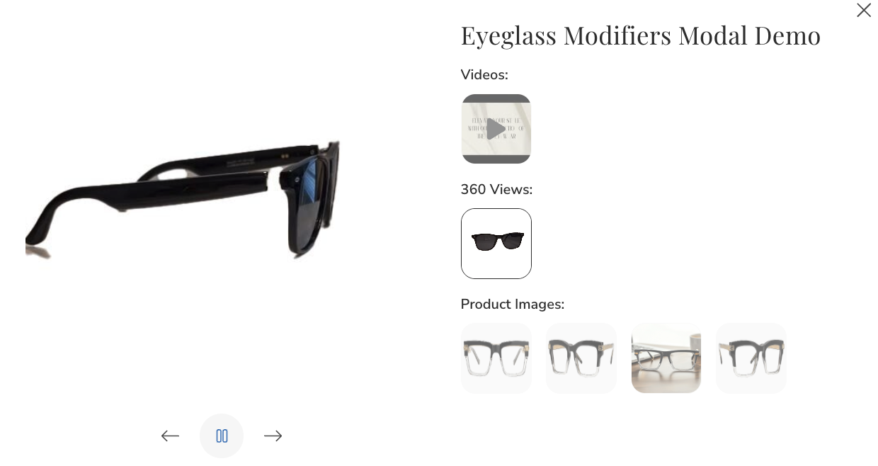
To showcase a 360-degree image gallery on your Product Detail Page (PDP), begin by uploading the 360-degree image to your Image Manager and copying its link:
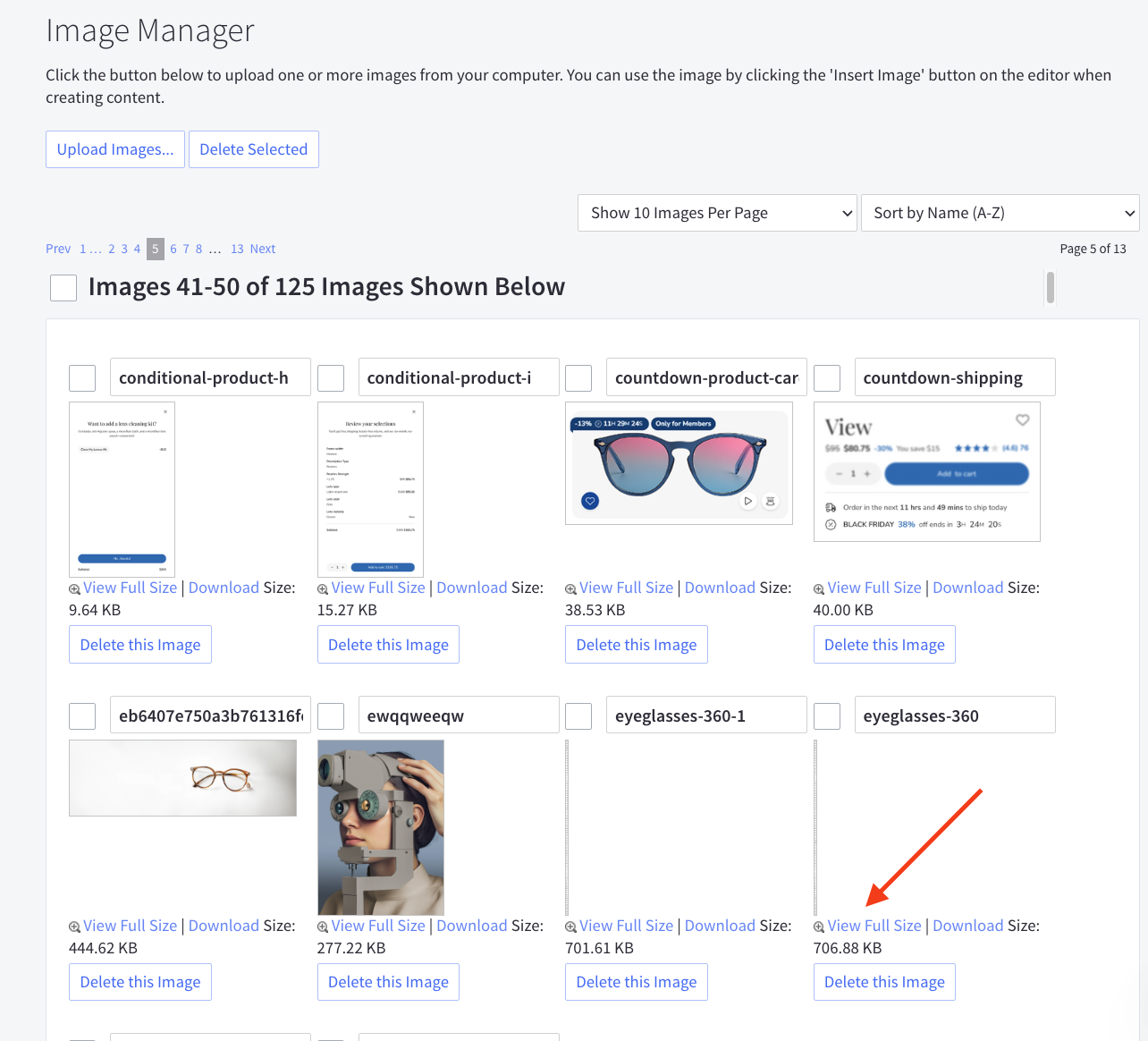
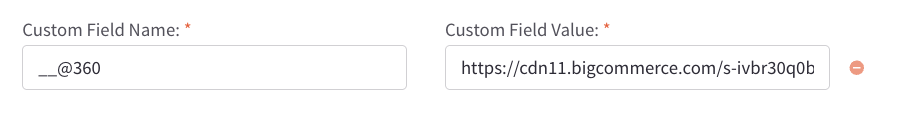
Next, edit the product and add a custom field named __@360. Assign the image link as the value for this field. To display multiple 360-degree images, simply add additional custom fields using the same name.
If your image sequence contains, for example, 90 frames, append #90 to the end of the image link. For example: https://cdn11.bigcommerce.com/s-ivbr30q0b6/images/stencil/original/image-manager/eyeglasses-360-1.jpg?t=1736752328#90
You can download a sample 360-degree image here: https://cdn11.bigcommerce.com/s-ivbr30q0b6/images/stencil/original/image-manager/eyeglasses-360-1.jpg
Displaying Product Card Hover Videos
To display videos when hovering over product images on product cards, you need to enable the feature in theme settings first.
Enabling Video Hover Feature
Navigate to Page Builder > Theme Styles > Products > Product Cards and enable the Show video from custom field __@card_video when hovering product card checkbox.
Adding Video to Products
Once the feature is enabled, edit your product and add a custom field named __@card_video. Set the video URL as the value for this field. The video will automatically play when users hover over the product image on the product card and pause when they hover away.
Example:
- Custom Field Name:
__@card_video - Custom Field Value:
https://storage.themeforshop.com/eyeva-demo/laptop-360-1-h265.mp4
Important Notes:
- Video must be in MP4 format for maximum browser compatibility
- Use videos with small file sizes to optimize loading time
- Videos will automatically play muted when hovered
- Only displays when "Show video from custom field __@card_video when hovering product card" is enabled in theme settings
You can view a sample video at: https://storage.themeforshop.com/eyeva-demo/laptop-360-1-h265.mp4
Variant Options Stepper
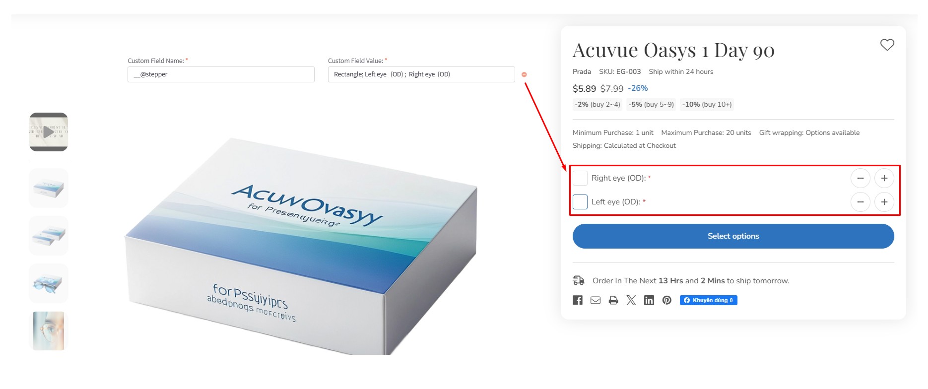
To create variant options with a Rectangle List type, follow these steps:
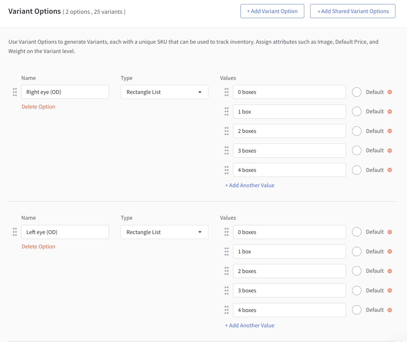
Next, add a custom field named __@stepper. The value of this field should contain the option names, separated by semicolons (;).
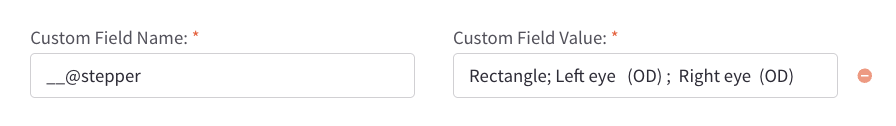
For example:
- Custom Field Name:
__@stepper - Custom Field Value:
Left eye (OD); Right eye (OS)
Eyeglasses Product Description Template
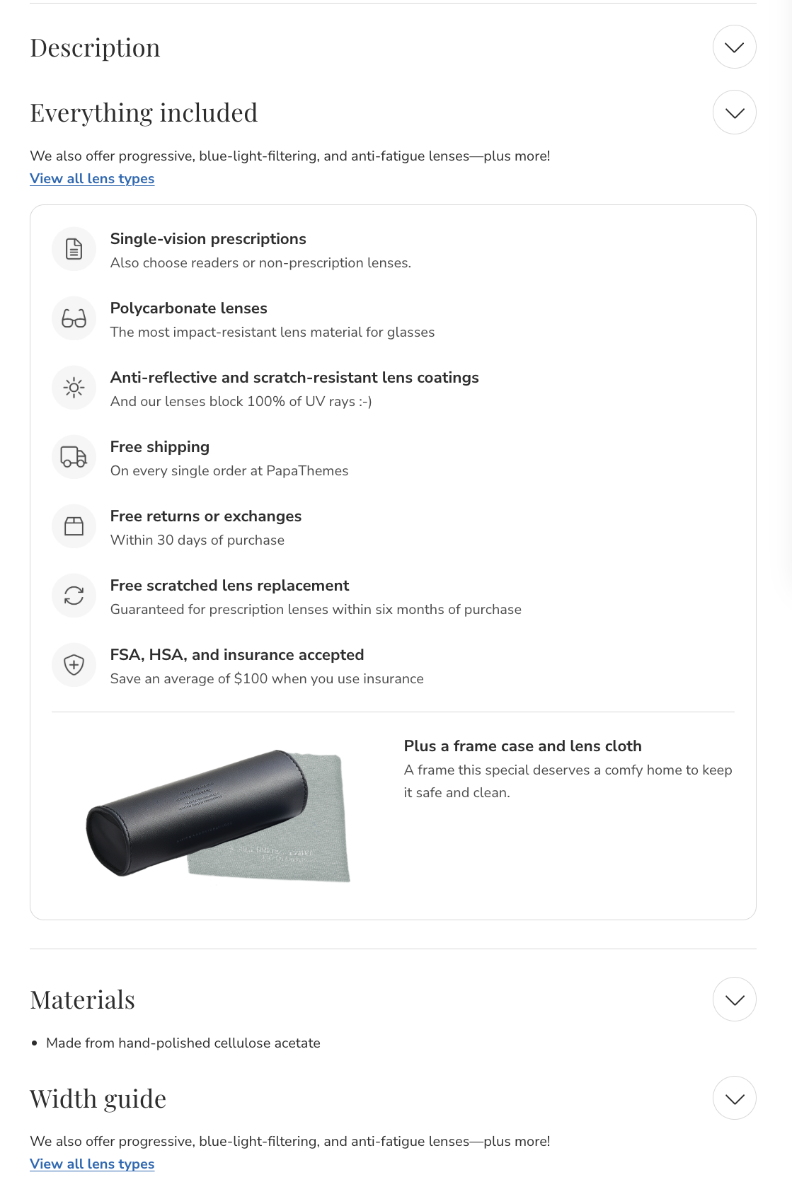
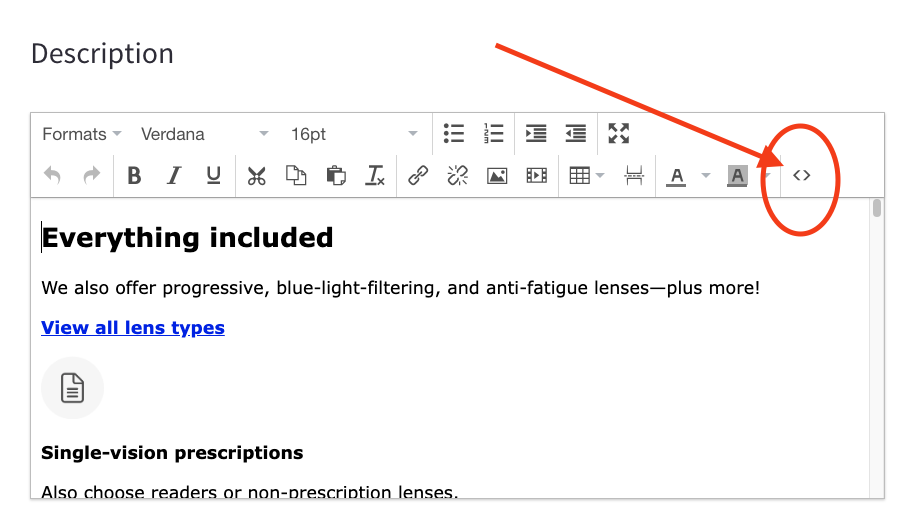
To use our pre-designed eyeglasses product description template, edit your product description, select the Source code button, and paste the code provided below:
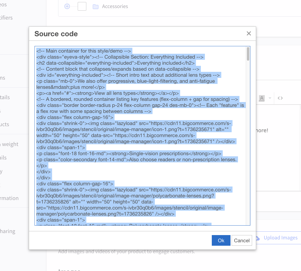
<!-- Main container for this style/demo -->
<div class="eyeva-style">
<!-- Collapsible Section: Everything Included -->
<h2 data-collapsible="everything-included">Everything included</h2>
<!-- Content block that collapses/expands based on data-collapsible -->
<div id="everything-included">
<!-- Short intro text about additional lens types -->
<p class="mb-0">We also offer progressive, blue-light-filtering, and anti-fatigue lenses—plus more!</p>
<p><a href="#"><strong>View all lens types</strong></a></p>
<!-- A bordered, rounded container listing key features (flex-column + gap for spacing) -->
<div class="border border-radius p-24 flex-column gap-24 des-mb-0">
<!-- Each "feature" is a flex row with some spacing between columns -->
<div class="flex column-gap-16">
<div class="shrink-0"><img class="lazyload" src="https://cdn11.bigcommerce.com/s-ivbr30q0b6/images/stencil/original/image-manager/icon-1.png?t=1736235671" alt="" width="50" height="50" data-src="https://cdn11.bigcommerce.com/s-ivbr30q0b6/images/stencil/original/image-manager/icon-1.png?t=1736235671" /></div>
<div class="span-1">
<p class="font-18 font-16-md"><strong>Single-vision prescriptions</strong></p>
<p class="color-secondary font-14-md">Also choose readers or non-prescription lenses.</p>
</div>
</div>
<div class="flex column-gap-16">
<div class="shrink-0"><img class="lazyload" src="https://cdn11.bigcommerce.com/s-ivbr30q0b6/images/stencil/original/image-manager/polycarbonate-lenses.png?t=1736235826" alt="" width="50" height="50" data-src="https://cdn11.bigcommerce.com/s-ivbr30q0b6/images/stencil/original/image-manager/polycarbonate-lenses.png?t=1736235826" /></div>
<div class="span-1">
<p class="font-18 font-16-md"><strong>Polycarbonate lenses</strong></p>
<p class="color-secondary font-14-md">The most impact-resistant lens material for glasses</p>
</div>
</div>
<div class="flex column-gap-16">
<div class="shrink-0"><img class="lazyload" src="https://cdn11.bigcommerce.com/s-ivbr30q0b6/images/stencil/original/image-manager/anti-reflective.png?t=1736235838" alt="" width="50" height="50" data-src="https://cdn11.bigcommerce.com/s-ivbr30q0b6/images/stencil/original/image-manager/anti-reflective.png?t=1736235838" /></div>
<div class="span-1">
<p class="font-18 font-16-md"><strong>Anti-reflective and scratch-resistant lens coatings</strong></p>
<p class="color-secondary font-14-md">And our lenses block 100% of UV rays :-)</p>
</div>
</div>
<div class="flex column-gap-16">
<div class="shrink-0"><img class="lazyload" src="https://cdn11.bigcommerce.com/s-ivbr30q0b6/images/stencil/original/image-manager/free-shipping-1736235871686.png?t=1736235872" alt="" width="50" height="50" data-src="https://cdn11.bigcommerce.com/s-ivbr30q0b6/images/stencil/original/image-manager/free-shipping-1736235871686.png?t=1736235872" /></div>
<div class="span-1">
<p class="font-18 font-16-md"><strong>Free shipping</strong></p>
<p class="color-secondary font-14-md">On every single order at PapaThemes</p>
</div>
</div>
<div class="flex column-gap-16">
<div class="shrink-0"><img class="lazyload" src="https://cdn11.bigcommerce.com/s-ivbr30q0b6/images/stencil/original/image-manager/free-returns.png?t=1736235889" alt="" width="50" height="50" data-src="https://cdn11.bigcommerce.com/s-ivbr30q0b6/images/stencil/original/image-manager/free-returns.png?t=1736235889" /></div>
<div class="span-1">
<p class="font-18 font-16-md"><strong>Free returns or exchanges</strong></p>
<p class="color-secondary font-14-md">Within 30 days of purchase</p>
</div>
</div>
<div class="flex column-gap-16">
<div class="shrink-0"><img class="lazyload" src="https://cdn11.bigcommerce.com/s-ivbr30q0b6/images/stencil/original/image-manager/free-scratched.png?t=1736235905" alt="" width="50" height="50" data-src="https://cdn11.bigcommerce.com/s-ivbr30q0b6/images/stencil/original/image-manager/free-scratched.png?t=1736235905" /></div>
<div class="span-1">
<p class="font-18 font-16-md"><strong>Free scratched lens replacement</strong></p>
<p class="color-secondary font-14-md">Guaranteed for prescription lenses within six months of purchase</p>
</div>
</div>
<div class="flex column-gap-16">
<div class="shrink-0"><img class="lazyload" src="https://cdn11.bigcommerce.com/s-ivbr30q0b6/images/stencil/original/image-manager/fsa-hsa.png?t=1736235920" alt="" width="50" height="50" data-src="https://cdn11.bigcommerce.com/s-ivbr30q0b6/images/stencil/original/image-manager/fsa-hsa.png?t=1736235920" /></div>
<div class="span-1">
<p class="font-18 font-16-md"><strong>FSA, HSA, and insurance accepted</strong></p>
<p class="color-secondary font-14-md">Save an average of $100 when you use insurance</p>
</div>
</div>
<!-- Horizontal rule within the "everything included" section -->
<hr class="m-0" />
<!-- Another feature row with an image and description -->
<div class="flex gap-24">
<div class="span-1"><img class="lazyload" src="https://cdn11.bigcommerce.com/s-ivbr30q0b6/images/stencil/original/image-manager/tvlgiao-plus-a-frame-case-and-lens-cloth-minimals-realictis-whi-e0eae8ca-7a79-4951-8b52-d395d7889fe3-1736226571449.png?t=1736226572" alt="" width="400" height="200" data-src="https://cdn11.bigcommerce.com/s-ivbr30q0b6/images/stencil/original/image-manager/tvlgiao-plus-a-frame-case-and-lens-cloth-minimals-realictis-whi-e0eae8ca-7a79-4951-8b52-d395d7889fe3-1736226571449.png?t=1736226572" /></div>
<div class="span-1">
<p class="font-18 font-16-md"><strong>Plus a frame case and lens cloth</strong></p>
<p class="color-secondary font-14-md">A frame this special deserves a comfy home to keep it safe and clean.</p>
</div>
</div>
</div>
</div>
<!-- /#everything-included -->
<!-- Horizontal rule separating sections -->
<hr />
<!-- Collapsible Section: Materials -->
<h2 data-collapsible="materials">Materials</h2>
<div id="materials">
<ul>
<li>Made from hand-polished cellulose acetate</li>
</ul>
</div>
<!-- Collapsible Section: Width Guide -->
<h2 data-collapsible="width-guide">Width guide</h2>
<div id="width-guide">
<p class="mb-0">We also offer progressive, blue-light-filtering, and anti-fatigue lenses—plus more!</p>
<p><a href="#"><strong>View all lens types</strong></a></p>
<!-- Bordered container for the width guide info -->
<div class="border border-radius mb-16 des-mb-0"><!-- Row with image and text, using .flex for layout -->
<div class="flex p-24 gap-24">
<div class="shrink-0"><img class="lazyload" src="https://cdn11.bigcommerce.com/s-ivbr30q0b6/images/stencil/original/image-manager/frame-widths.png?t=1736236039" alt="" width="180" height="100" data-src="https://cdn11.bigcommerce.com/s-ivbr30q0b6/images/stencil/original/image-manager/frame-widths.png?t=1736236039" /></div>
<div class="span-1">
<p class="font-18 font-16-md"><strong>Frame widths</strong></p>
<p class="color-secondary font-14-md">Our widths are determined by the overall frame width. Choose a width that best corresponds with your own face. (You won’t find this number on glasses.)</p>
</div>
</div>
<!-- A filler line and text about the "Medium" size -->
<div class="fill-alt py-12 px-16 border-y">Medium</div>
<div class="py-12 px-16">137mm</div>
</div>
<!-- /.border-radius -->
<p><a href="#" data-collapsible="other-measurements">Other measurements</a></p>
<!-- Another collapsible area for other measurements -->
<div id="other-measurements" class="border border-radius mb-16 des-mb-0">
<div class="flex flex-column-md p-24 gap-24">
<div class="shrink-0 shrink-1-md"><img class="lazyload" src="https://cdn11.bigcommerce.com/s-ivbr30q0b6/images/stencil/original/image-manager/compare-lens.png?t=1736236095" alt="" width="180" height="100" data-src="https://cdn11.bigcommerce.com/s-ivbr30q0b6/images/stencil/original/image-manager/compare-lens.png?t=1736236095" /></div>
<div class="span-1">
<p class="font-18 font-16-md"><strong>Compare <code>lens width</code> with <code>bridge - temple length</code> with your glasses</strong></p>
<p class="color-secondary font-14-md">For most glasses, these measurements are found on the inside of the temple arm. If you have a pair you like, compare it to these measurements.</p>
<p class="mb-16"><a href="#" data-collapsible="what-do-these-measurements-mean">What do these measurements mean?</a></p>
<!-- Additional info block with some background shading -->
<div class="fill-alt border-radius p-16 flex-column gap-24"><!-- Repeating features, each with an image and a short description -->
<div class="flex gap-24">
<div class="shrink-0"><img class="lazyload" src="https://cdn11.bigcommerce.com/s-ivbr30q0b6/images/stencil/original/image-manager/lens-width.png?t=1736236187" alt="" width="100" height="60" data-src="https://cdn11.bigcommerce.com/s-ivbr30q0b6/images/stencil/original/image-manager/lens-width.png?t=1736236187" /></div>
<div class="span-1">
<p><strong>Lens width</strong></p>
<p class="color-secondary font-14-md">The horizontal diameter of one lens (and the first measurement in the series)</p>
</div>
</div>
<div class="flex gap-24">
<div class="shrink-0"><img class="lazyload" src="https://cdn11.bigcommerce.com/s-ivbr30q0b6/images/stencil/original/image-manager/bridge.png?t=1736236204" alt="" width="100" height="60" data-src="https://cdn11.bigcommerce.com/s-ivbr30q0b6/images/stencil/original/image-manager/bridge.png?t=1736236204" /></div>
<div class="span-1">
<p><strong>Bridge</strong></p>
<p class="color-secondary font-14-md">The width of the bridge (and the second measurement in the series)</p>
</div>
</div>
<div class="flex gap-24">
<div class="shrink-0"><img class="lazyload" src="https://cdn11.bigcommerce.com/s-ivbr30q0b6/images/stencil/original/image-manager/temple-length-1736236238577.png?t=1736236239" alt="" width="100" height="60" data-src="https://cdn11.bigcommerce.com/s-ivbr30q0b6/images/stencil/original/image-manager/temple-length-1736236238577.png?t=1736236239" /></div>
<div class="span-1">
<p><strong>Temple length</strong></p>
<p class="color-secondary font-14-md">The length of the entire temple arm, from the front to the tip (and the last measurement)</p>
</div>
</div>
</div>
<!-- /.fill-alt -->
</div>
<!-- /.span-1 -->
</div>
<!-- /.flex -->
<!-- A row showing column headers for lens width, bridge, temple length -->
<div class="fill-alt flex child-span-1 border-y color-secondary font-14-md">
<div class="py-12 px-16"> </div>
<div class="py-12 px-16 border-left">Lens width</div>
<div class="py-12 px-16 border-left">Bridge</div>
<div class="py-12 px-16 border-left">Temple length</div>
</div>
<!-- A row with actual measurements for "Medium" frame sizing -->
<div class="flex child-span-1 font-14-md">
<div class="fill-alt py-12 px-16 color-secondary">Medium</div>
<div class="py-12 px-16 border-left">50mm</div>
<div class="py-12 px-16 border-left">20mm</div>
<div class="py-12 px-16 border-left">140mm</div>
</div>
</div>
<!-- /#other-measurements -->
<!-- A horizontal flex container with a bold heading and a button link -->
<div class="flex flex-column-md border border-radius p-24 gap-24 align-items-center align-items-start-md des-mb-0">
<div class="span-1"><strong class="font-18 font-16-md">Don't have a pair of glasses?</strong></div>
<div class="shrink-0"><a class="button button--outline" href="#"> Measure using a credit card </a></div>
</div>
<!-- Section: Prescription and lens types offered -->
<h2 data-collapsible="prescription-and-lens-types-offered">Prescription and lens types offered</h2>
<div id="prescription-and-lens-types-offered">
<p><a class="button button--outline mb-0" href="#">Learn more in our lens guide</a></p>
<!-- "Prescription type" table-like layout -->
<div class="flex flex-column-md border border-radius mb-16">
<div class="span-1 p-24"><strong class="font-18 font-16-md">Prescription type</strong></div>
<div class="span-2 flex-column border-left font-14-md"><!-- Header row with fill-alt background and two columns -->
<div class="flex child-py-12 child-px-16">
<div class="span-1 fill-alt"> </div>
<div class="span-1 fill-alt border-left">Starting price</div>
</div>
<!-- Progressive listing row -->
<div class="flex child-py-12 child-px-16 border-top">
<div class="span-1 fill-alt">Single-vision</div>
<div class="span-1 border-left"><s>$95</s> <strong>$80.75</strong></div>
</div>
<div class="flex child-py-12 child-px-16 border-top">
<div class="span-1 fill-alt">Progressive</div>
<div class="span-1 border-left"><s>$295</s> <strong>$250.75</strong></div>
</div>
<div class="flex child-py-12 child-px-16 border-top">
<div class="span-1 fill-alt">Readers</div>
<div class="span-1 border-left"><s>$95</s> <strong>$80.75</strong></div>
</div>
<div class="flex child-py-12 child-px-16 border-top">
<div class="span-1 fill-alt">Non-prescription</div>
<div class="span-1 border-left"><s>$95</s> <strong>$80.75</strong></div>
</div>
</div>
</div>
<!-- /.flex border -->
<!-- "Lens type" table-like layout -->
<div class="flex flex-column-md border border-radius mb-16">
<!-- Left label column -->
<div class="span-1 p-24"><strong class="font-18 font-16-md">Lens type</strong></div>
<!-- Right column with stacked rows -->
<div class="span-2 flex-column border-left font-14-md"><!-- Header row with two columns, second has border-left -->
<div class="flex child-py-12 child-px-16">
<div class="span-1 fill-alt"> </div>
<div class="span-1 fill-alt border-left">Additional cost</div>
</div>
<!-- Each subsequent row has border-top and two columns -->
<div class="flex child-py-12 child-px-16 border-top">
<div class="span-1 fill-alt">Classic</div>
<div class="span-1 border-left">Free</div>
</div>
<div class="flex child-py-12 child-px-16 border-top">
<div class="span-1 fill-alt">Blue-light filtering</div>
<div class="span-1 border-left"><s>$50</s> <strong>$42.50</strong></div>
</div>
<div class="flex child-py-12 child-px-16 border-top">
<div class="span-1 fill-alt">Anti-fatigue</div>
<div class="span-1 border-left"><s>$50</s> <strong>$42.50</strong></div>
</div>
<div class="flex child-py-12 child-px-16 border-top">
<div class="span-1 fill-alt">Light-responsive</div>
<div class="span-1 border-left"><s>$100</s> <strong>$85</strong></div>
</div>
</div>
<!-- /.span-2.flex-column -->
</div>
<!-- /Lens type block -->
<!-- "Lens material" table-like layout -->
<div class="flex flex-column-md border border-radius"><!-- Left column for title -->
<div class="span-1 p-24"><strong class="font-18 font-16-md">Lens material</strong></div>
<!-- Right column with stacked rows -->
<div class="span-2 flex-column border-left font-14-md"><!-- Header row -->
<div class="flex child-py-12 child-px-16">
<div class="span-1 fill-alt"> </div>
<div class="span-1 fill-alt border-left">Additional cost</div>
</div>
<!-- Material row: Polycarbonate -->
<div class="flex child-py-12 child-px-16 border-top">
<div class="span-1 fill-alt">Polycarbonate</div>
<div class="span-1 border-left">Free</div>
</div>
<!-- Material row: 1.67 high-index -->
<div class="flex child-py-12 child-px-16 border-top">
<div class="span-1 fill-alt">1.67 high-index</div>
<div class="span-1 border-left"><s>$50</s> <strong>$42.50</strong></div>
</div>
</div>
<!-- /.span-2.flex-column -->
</div>
<!-- /Lens material block -->
</div>
<!-- /#prescription-and-lens-types-offered -->
</div>
<!-- /#width-guide -->
<!-- Collapsible Section: Need a Prescription? -->
<h2 data-collapsible="need-a-prescription">Need a prescription?</h2>
<div id="need-a-prescription">
<!-- Option #1: In-person eye exam -->
<div class="border border-radius p-24 flex gap-24 mb-16">
<div class="shrink-0"><img class="lazyload" src="https://cdn11.bigcommerce.com/s-ivbr30q0b6/images/stencil/original/image-manager/book-an-in-person-eye-exam-1736828402708.png?t=1736828403" alt="" width="160" height="160" data-src="https://cdn11.bigcommerce.com/s-ivbr30q0b6/images/stencil/original/image-manager/book-an-in-person-eye-exam-1736828402708.png?t=1736828403" /></div>
<div class="span-1">
<p class="font-18 font-16-md mb-0"><strong>Book an in-person eye exam</strong></p>
<p class="color-secondary font-14-md">Meet with an eye doctor at one of our stores for a new prescription and eye health check.</p>
<a class="button button--outline" href="#">Schedule an exam</a>
</div>
</div>
<!-- Option #2: Renew at home -->
<div class="border border-radius p-24 flex gap-24 mb-16">
<div class="shrink-0"><img class="lazyload" src="https://cdn11.bigcommerce.com/s-ivbr30q0b6/images/stencil/original/image-manager/renew-your-prescription-at-home-1736236325022.png?t=1736236326" alt="" width="160" height="160" data-src="https://cdn11.bigcommerce.com/s-ivbr30q0b6/images/stencil/original/image-manager/renew-your-prescription-at-home-1736236325022.png?t=1736236326" /></div>
<div class="span-1">
<p class="font-18 font-16-md mb-0"><strong>Renew your prescription at home</strong></p>
<p class="color-secondary font-14-md">If your vision hasn't changed, use Virtual Vision Test on an iPhone to renew your prescription from home.</p>
<a class="button button--outline" href="#">Renew your prescription</a>
</div>
</div>
<!-- Already have a prescription? -->
<p class="font-18 font-16-md mb-0"><strong>Already have a non-expired prescription?</strong></p>
<p class="color-secondary font-14-md">During checkout, you'll be able to upload it, have us contact your doctor to retrieve it, or send it after you place your order.</p>
</div>
<!-- /#need-a-prescription -->
</div>
Save your changes. The product description will now display as shown in the image above.
HTML Code Details
Here's a breakdown of the classes and attributes used in the HTML code:
| Class / Attribute | Description / Usage |
|---|---|
.eyeva-style |
Main class to apply utility classes. |
.flex |
Enables flexbox layout, aligning children in a row or column. |
.flex-column-md |
At tablet screen sizes and smaller, this stacks the flex items vertically. |
.gap-24, .column-gap-16 |
Adds consistent spacing (24px or 16px) between flex items. |
.shrink-0, .shrink-1-md |
Controls how flex items shrink. .shrink-0 prevents shrinking, while .shrink-1-md allows shrinking on tablet screens and below. |
.span-1, .span-2 |
Defines the number of columns an element spans within a flex or grid layout. |
.child-span-1 |
Applies .span-1 (or similar) to all direct children of the container. |
.child-py-12, .child-px-16 |
Adds uniform vertical (12px) or horizontal (16px) padding to all direct children. |
.border, .border-radius |
Adds a 1px border and rounds the corners of an element. |
.border-y, .border-left, .border-top |
Applies a border to specific sides: top/bottom, left, or top. |
.fill-alt |
Used for alternate background colors, often a light shade to distinguish rows or blocks. |
.p-24, .py-12, .px-16 |
Utility classes for padding: .p-24 adds 24px padding on all sides; .py-12 adds 12px to top/bottom; .px-16 adds 16px to left/right. |
.mb-0, .des-mb-0 |
Removes bottom margin (margin-bottom: 0). The des- prefix might target descendent elements. |
.font-18, .font-16-md, .font-14-md |
Utility classes for font sizes at different screen sizes (e.g., 18px on desktop, 16px on tablet and below). |
.color-secondary |
Applies a secondary color to text. |
.button.button--outline |
Styles an element as an outlined button. |
data-collapsible="example" |
A custom attribute that toggles collapsible sections. JavaScript typically targets elements with this attribute and shows/hides the corresponding content. |
How data-collapsible Works:
- Each heading or link with
data-collapsible="section-id"is linked to a<div id="section-id">block. - Clicking the heading/link toggles the visibility of the
divwith the matchingid.
These classes and the data-collapsible attribute work together to create a well-structured, responsive, and collapsible layout, minimizing the need for extensive custom CSS or JavaScript.