Setting Up the Glasses Style Home Page
To start customizing the theme, log in to your admin panel. Navigate to Storefront > My Themes and click the Customize button next to the theme thumbnail.
Header
To configure the header, navigate to Theme Styles > Header. Here, you can adjust the header colors, store logo position, and size.
Utility navigation allows you to customize the colors of the search, cart, wishlist, and user icons.
Watch the instruction video:
Main Navigation
Main Navigation allows you to customize the navigation bar. You can change the menu type to column, dropdown menu, or mega menu, and also modify the colors of the top menu and submenus.
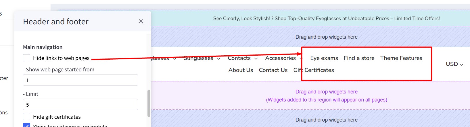
The "Hide webpage links" option allows you to hide static webpage links in the main navigation.
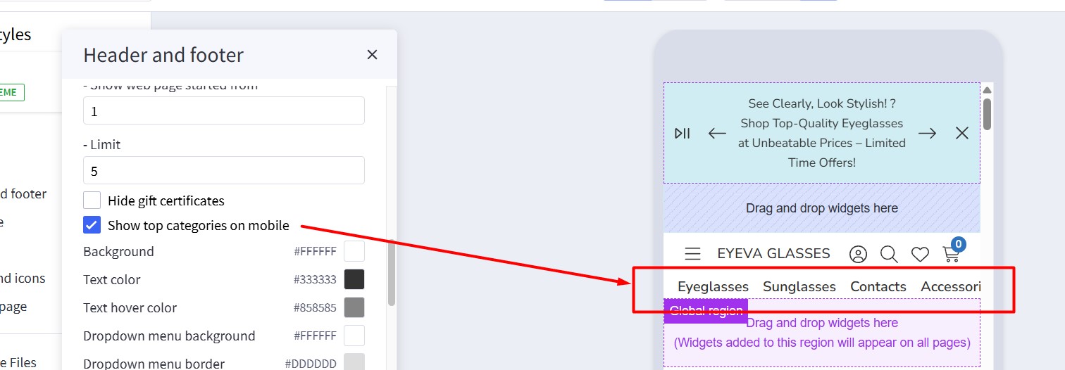
The "Show top categories on mobile" option displays top categories on mobile devices.
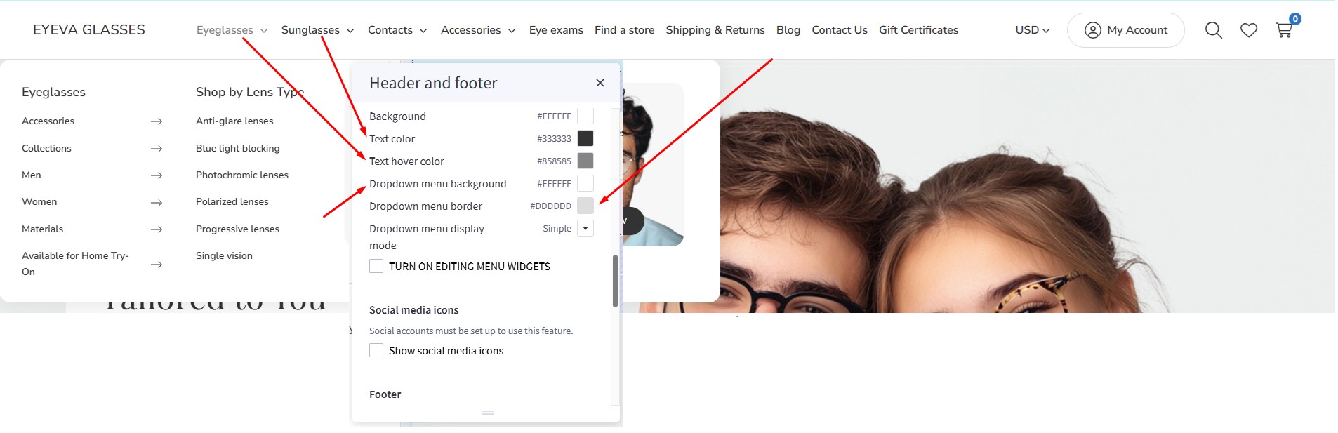
To configure the Main Navigation, navigate to Theme Styles > Header and Footer. In the Main Navigation section, you can adjust the following:
- Background: The background color of the top categories.
- Text color: The text color of menu items.
- Text hover color: The text color when hovering over menu items.
- Dropdown menu background: The background color of the submenu block.
- Dropdown menu border: The border color at the bottom of the main navigation.
Mega Menu vs. Standard Menu
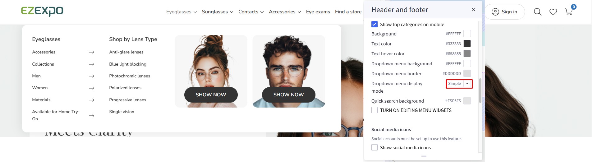
To configure the style (mega menu, standard menu, etc.) of the main navigation, go to Theme Styles > Header. In Main Navigation, select Menu Style. The theme offers two options:
Simple: Displays the submenu in a mega menu style. The Simple Menu allows you to insert banners and products.
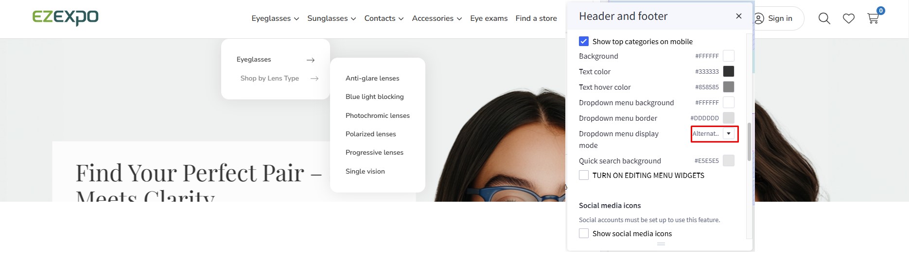
Alternate: Displays submenu items in a dropdown (standard) style.
Displaying Widgets on the Mega Menu
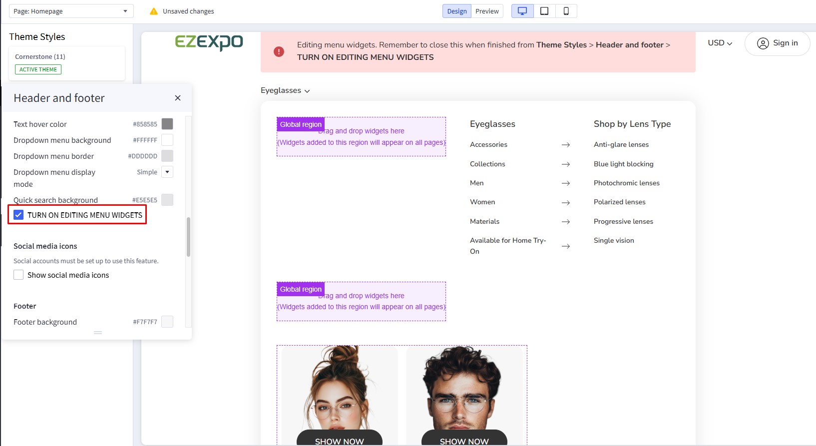
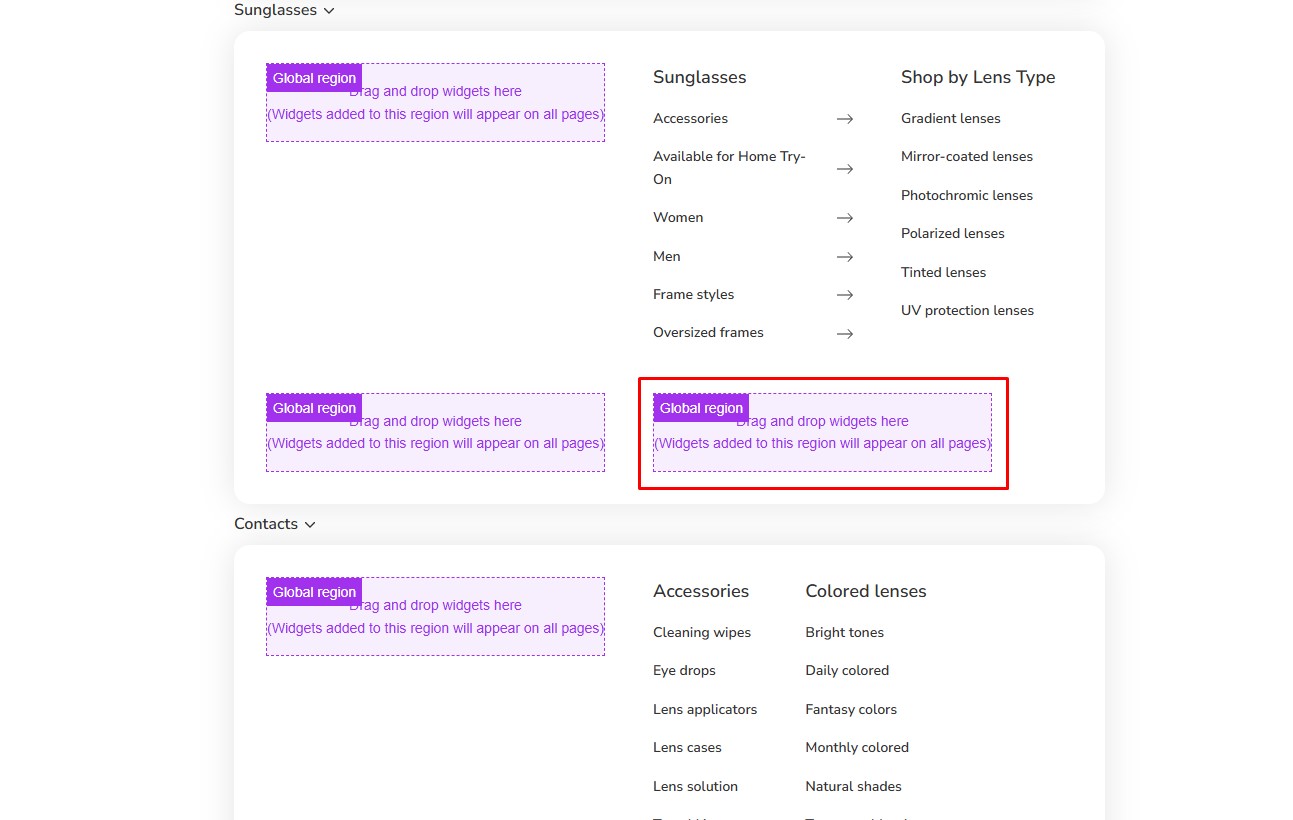
To display banners in the Mega Menu, go to Header and Footer and check TURN ON EDITING MENU WIDGETS to open the Mega Menu in design mode.
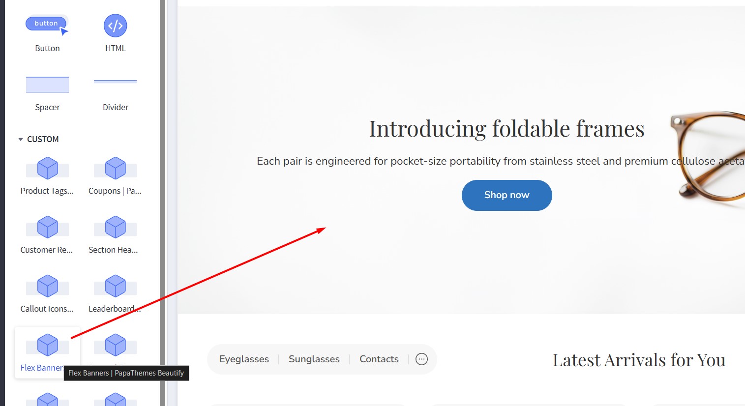
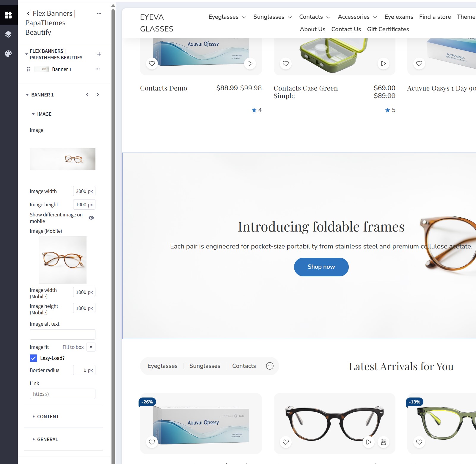
To customize the banner on the right of the submenu on mobile, drag and drop a Flex Banners | PapaThemes Beautify widget into the corresponding position:
In Column 1, set padding to 0.
Remove all banners except Banner 1. Select the image you want to upload. Set Image width to 250px, Image height to 250px, and Border radius to 16px.
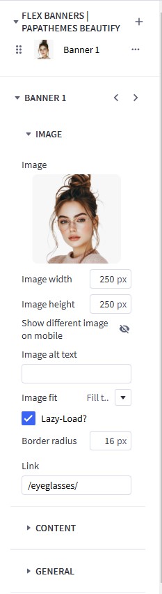
In CONTENT, click Center and Bottom for Content Align.
In Content Padding, Content Padding (Tablet), and Content Padding (Mobile), set Top, Right, Bottom, and Left to 16.
Hide the Heading Text.
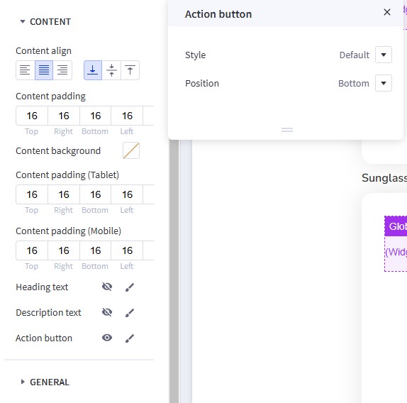
Show the Action Button. Set Style to Default and Position to Bottom.
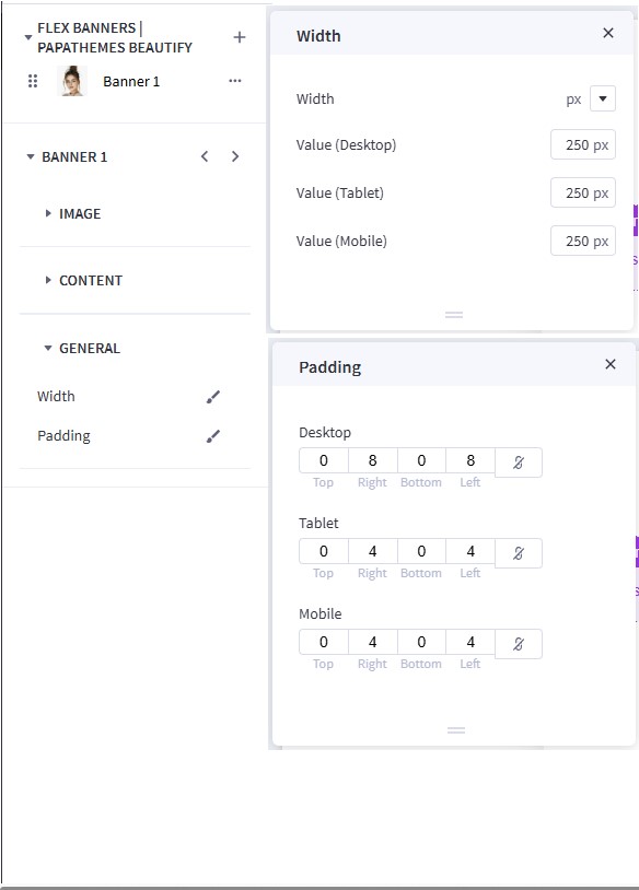
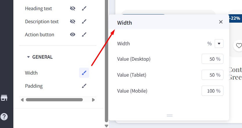
In GENERAL, edit the Width. Choose px for Width, and set Value (Desktop), Value (Tablet), and Value (Mobile) to 250px.
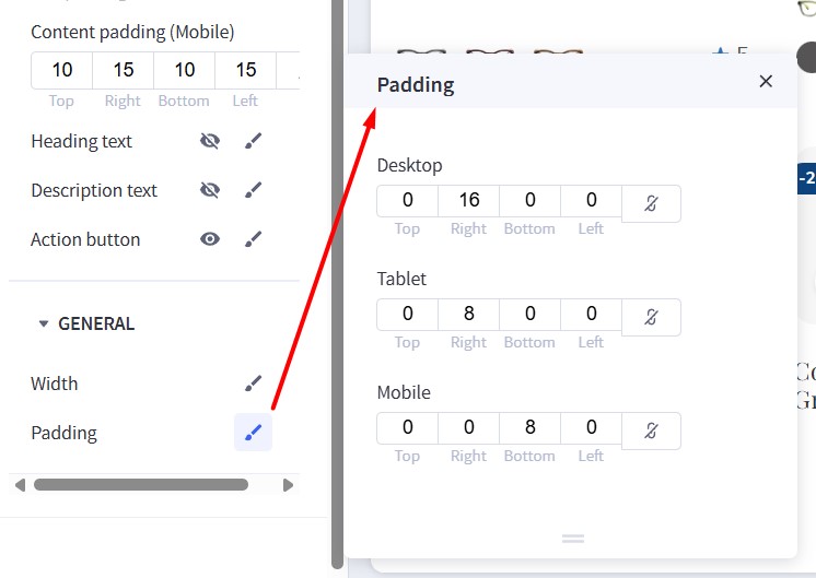
Edit the Padding. For Desktop, set Right and Left to 8. For Tablet, set Right and Left to 4. For Mobile, set Right to 4, Bottom to 0, and Left to 4.
Duplicate Banner 1 to create another banner.
Hide Web Page Links
To hide web page links such as Contact Us, About Us, and Shipping & Returns from the header, navigate to Theme Styles > Header. Locate the Hide Web Page Links option and select it to hide all links except Categories.
If you want to hide only specific links, follow these steps:
- Show web page starting from: Enter the order number of the first link you want to display.
- Limit: Enter the number of webpage links you want to display, starting from the specified order.
For example, to display only Blog and Shipping & Returns:
- Show web page starting from:
1 - Limit:
2
Note: The order only counts non-category links.

Watch the instruction video:
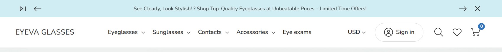
Top Banner
Go back to Storefront > My Themes, and click the Customize button beside the theme thumbnail. You can see the top banner above the header. To change the colors of the top banner, go to Theme Styles > General > Top Banners. Here, you can change the text color and background color.
Watch the instruction video:
Display Top Banner on All Pages
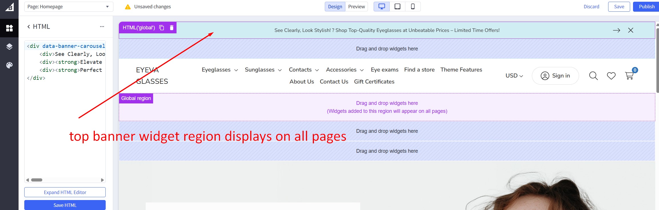
To display a top banner that appears on all pages in the header, drag and drop an HTML Widget into the desired position. Paste the code below into the HTML editor, and then click the Save HTML button.
<div data-banner-carousel style="text-align: center">
<div>See Clearly, Look Stylish! ? Shop Top-Quality Eyeglasses at Unbeatable Prices – Limited Time Offers!</div>
<div><strong>Elevate Your Vision, Elevate Your Style!</strong> ? Discover Our Exclusive Eyeglasses Collection at Amazing Prices – Shop Now!</div>
<div><strong>Perfect Your Look with Precision!</strong> ?️ Browse Our Premium Eyewear Range – Exceptional Deals Await!</div>
</div>
This code displays 3 messages in a carousel (specified by the data-banner-carousel attribute).
To display a simple message, you can just enter the HTML code like this:
<p>See Clearly, Look Stylish! ? Shop Top-Quality Eyeglasses at Unbeatable Prices – Limited Time Offers!</p>
Watch the instruction video:
Main Carousel
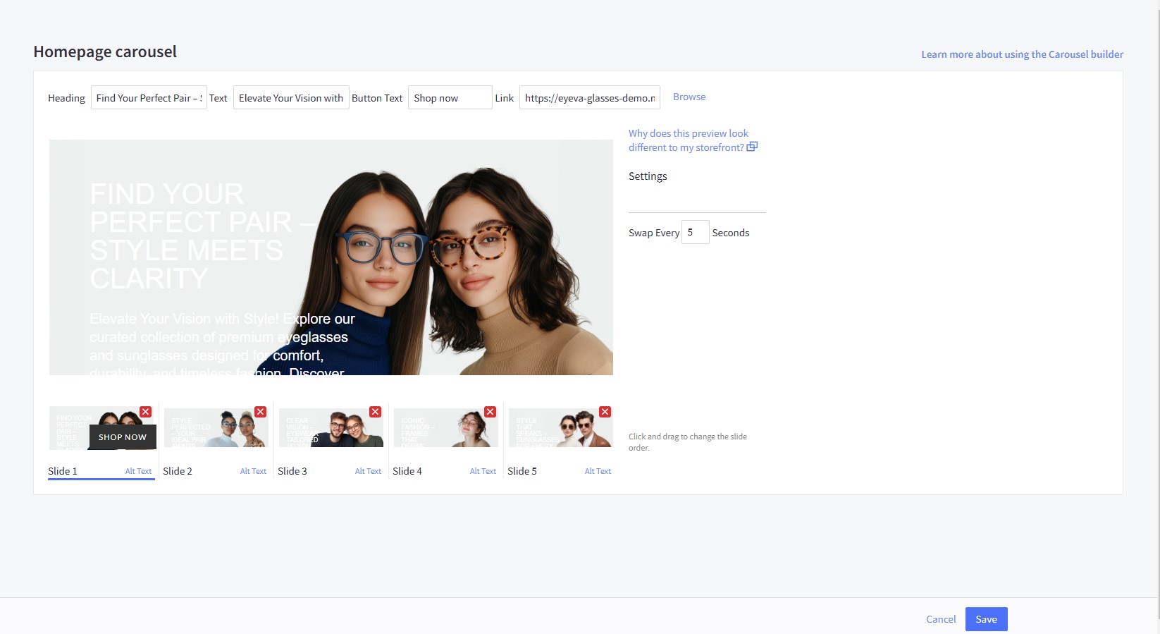
Upload the carousel images in Storefront > Home Page Carousel.
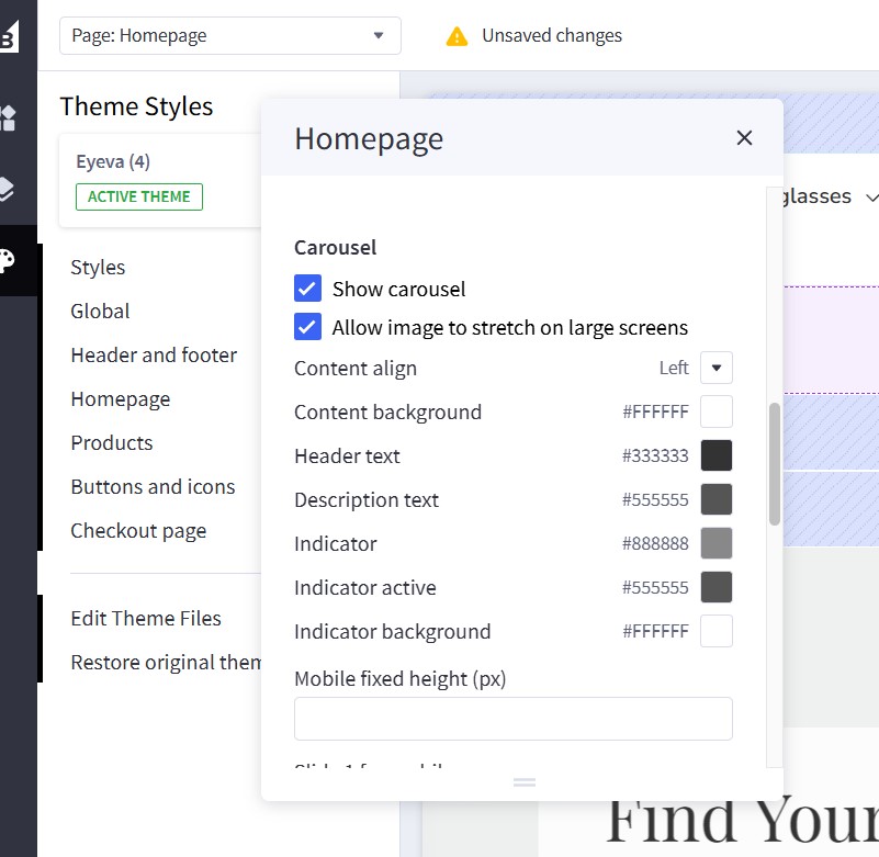
Return to Page Builder. Navigate to Theme Styles > Home Page and ensure that Carousel > Show carousel is enabled. You can customize the carousel styles and colors here.
To adjust the image height in mobile view, modify the Mobile fixed height (px) to your preferred dimension. For example, enter 500 to display a 500px height on mobile devices.
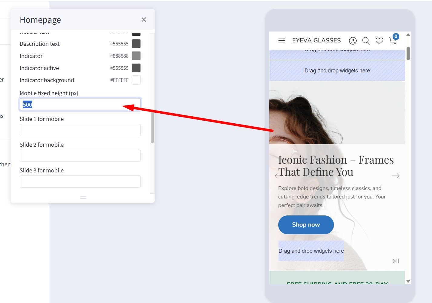
To display a different image on mobile, upload the image in the Image Manager. Then, copy the image URL and paste it into the corresponding Slide [Number] for mobile field (e.g., Slide 1 for mobile to Slide 5 for mobile).
Watch the instruction video:
Using the Hero Carousel for Multi-Storefronts
The BigCommerce homepage carousel is exclusive to the main channel and does not support multi-storefront deployments. As an alternative, we provide the "Hero Carousel | Eyeva" widget, which enables you to showcase an image carousel on any page or storefront.
To implement this:
- Install the widget from the PapaThemes Widgets app.
- In Page Builder, drag and drop the "Hero Carousel | Eyeva" widget into the appropriate widget area.
- Click on each slide to customize the content using the inline editor.
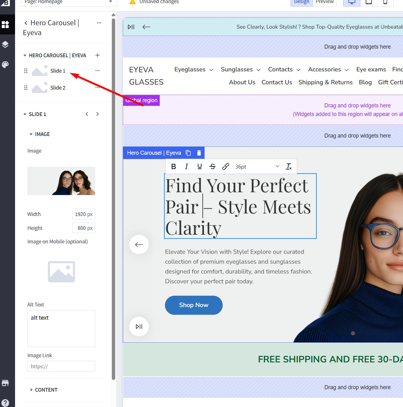
| Setting | Value |
|---|---|
| Slide 1 → Image | |
| Image | (Upload your image) |
| Width | 1920 px |
| Height | 800 px |
| Image on Mobile (optional) | (Upload a mobile-specific image) |
| Alt Text | alt text |
| Image Link | (Enter URL) |
| Content | |
| Heading | Visible |
| Description | Visible |
| Button 1 | Visible |
| Button 2 | Visible |
| Button 3 | Visible |
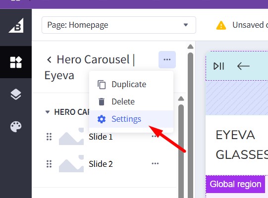
To adjust the widget settings, click the three-dot icon and select Settings:
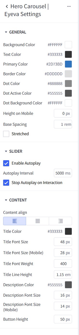
| Setting | Value |
|-------------|-----------------------------|---------------------|
| General | Background Color | #FFFFFF |
| | Text Color | #333333 |
| | Primary Color | #FFFFFF |
| | Border Color | #DDDDDD |
| | Dot Color | #AAAAAA |
| | Dot Active Color | #555555 |
| | Dot Background Color | #555555 |
| | Height on Mobile | 0 px |
| | Base Spacing | 1 rem |
| Slider | Enable Autoplay | Yes |
| | Autoplay Interval | 5000 ms |
| | Autoplay on Interaction | Yes |
| Content | Content align | Left |
| | Title Color | #333333 |
| | Title Font Size (Desktop) | 48 px |
| | Title Font Size (Mobile) | 24 px |
| | Title Font Weight | 400 |
| | Description Color | #555555 |
| | Description Font Size | 16 px |
| | Button Height | 50 px |
Free Shipping Banner below the Homepage Carousel
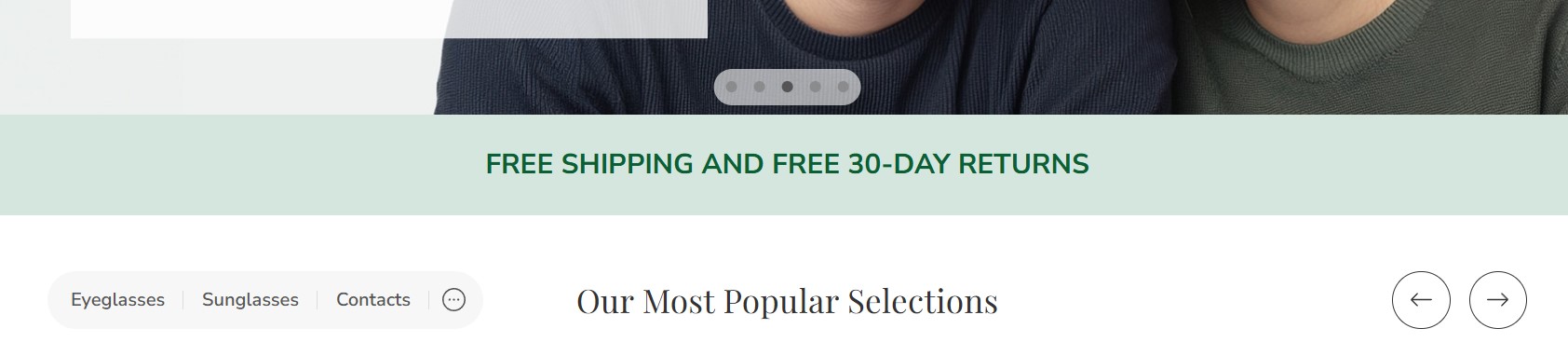
In Page Builder, drag and drop the Section Heading widget into the corresponding widget region:
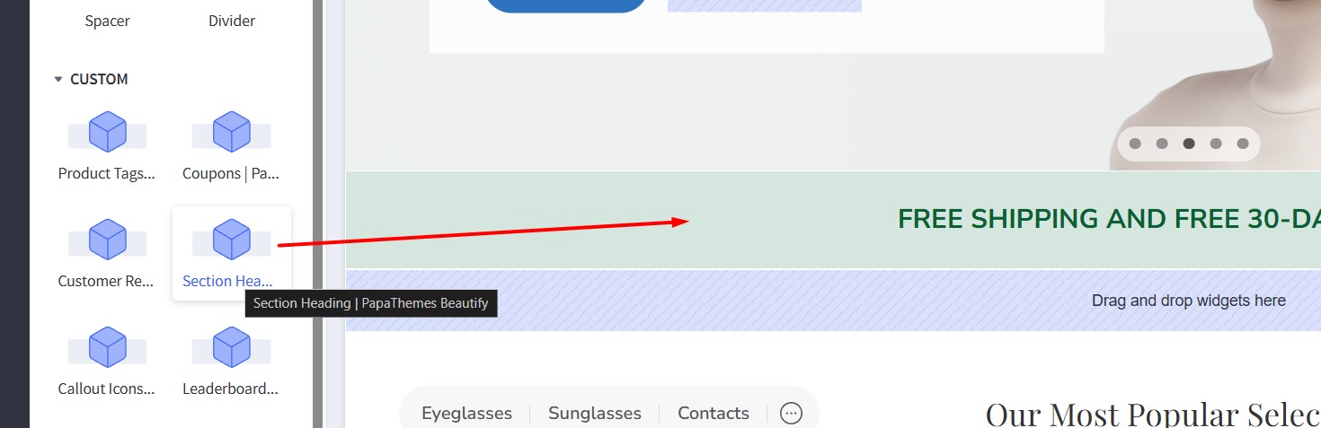
Configure the widget options as follows:
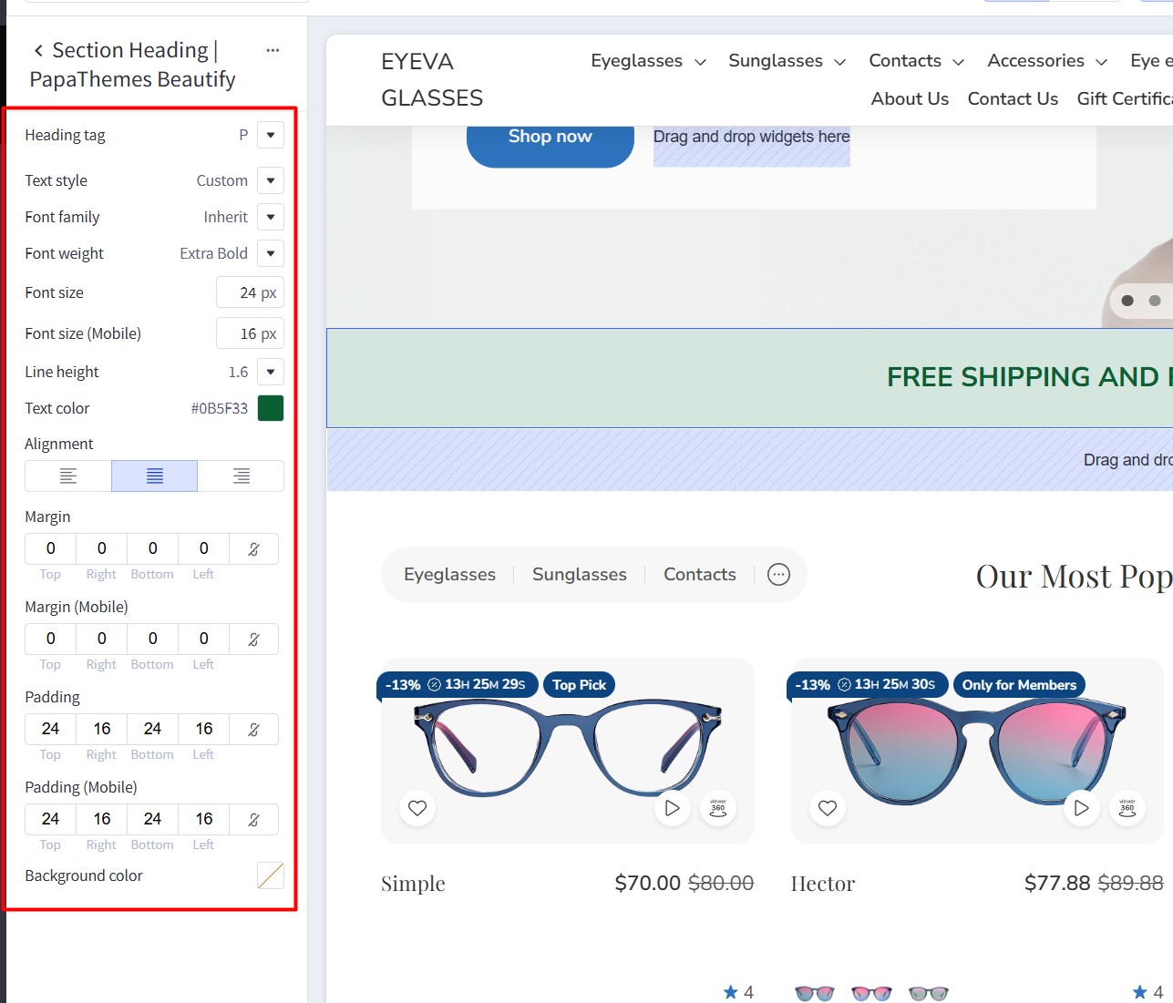
- Heading tag: P
- Text style: Custom
- Font family: Inherit
- Font weight: Extra Bold
- Font size (Desktop): 24px
- Font size (Mobile): 16px
- Line height: 1.6
- Text color: #0B5F33
- Alignment: Left / Center / Right
- Margin (Desktop): 0 0 0 0
- Margin (Mobile): 0 0 0 0
- Padding (Desktop): 24 16 24 16
- Padding (Mobile): 24 16 24 16
- Background color: Optional (color picker or hex code)
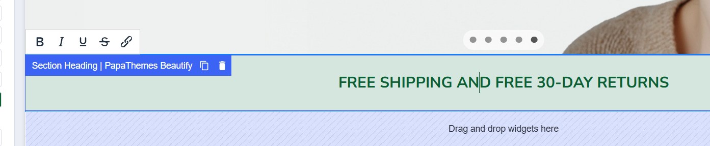
Edit the text using the inline editor:
Banner: Pick 5 pairs from our Home Try-On collection
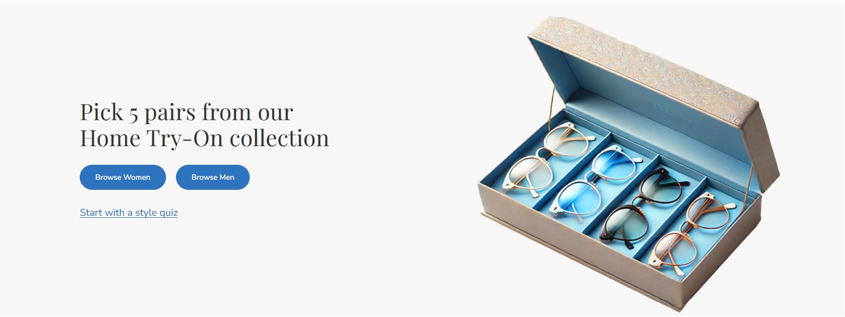
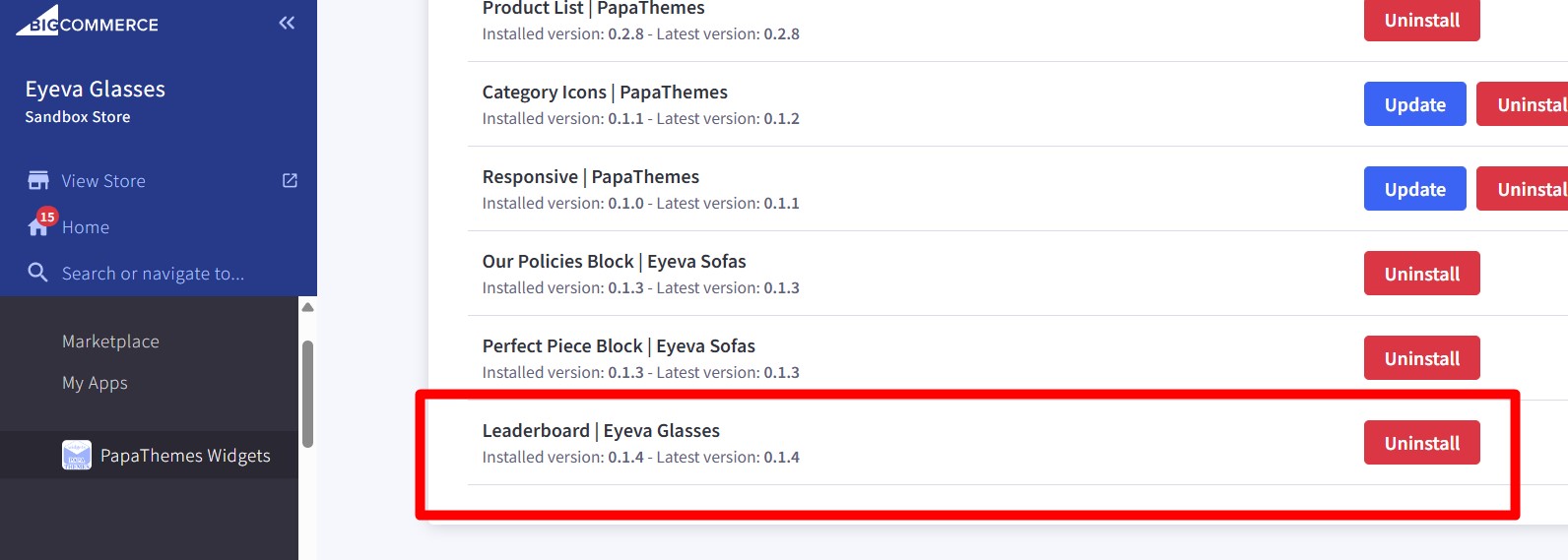
- Install the Leaderboard | Eyeva Glasses widget from our PapaThemes Widgets app:
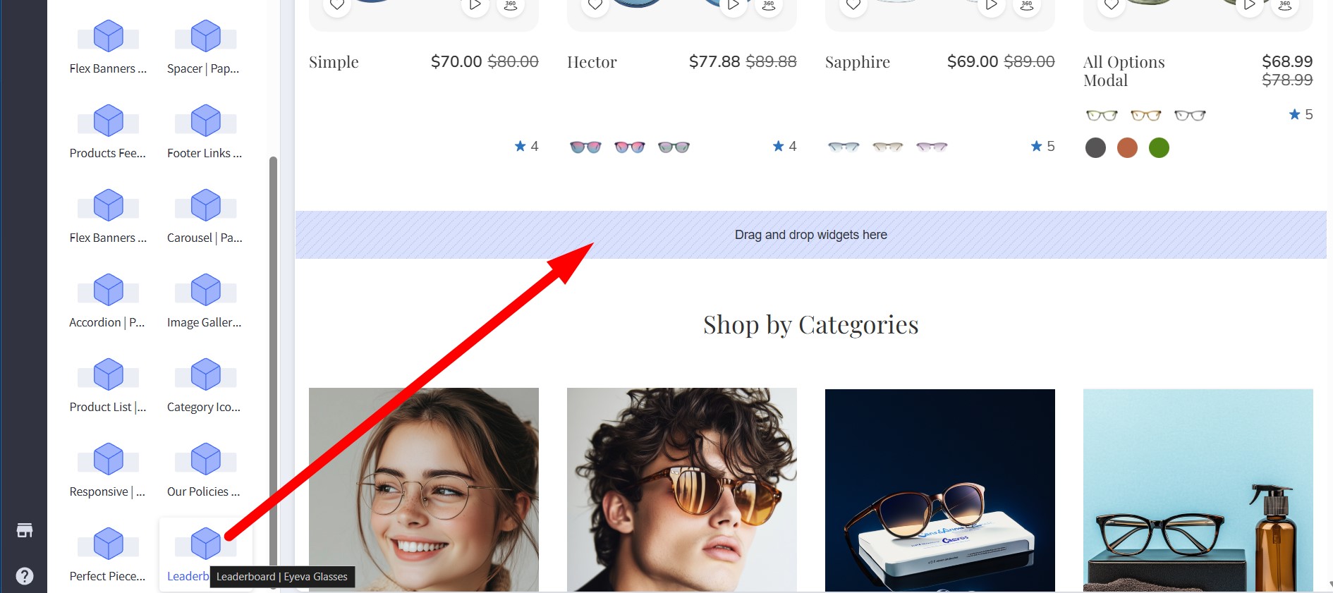
- In Page Builder, drag and drop the Leaderboard | Eyeva Glasses widget into the corresponding widget region:
- Configure the widget options as follows:
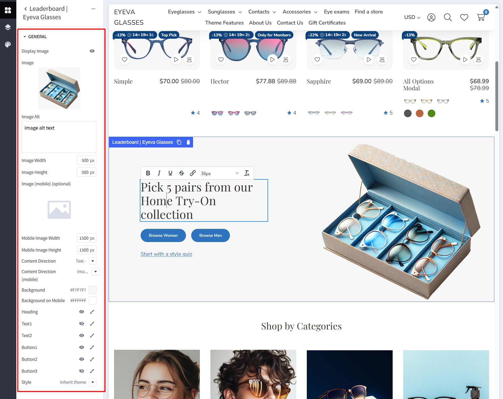
| Setting | Value |
|---|---|
| Display Image | Enabled (shows a banner image) |
| Image | (Preview of the “Try-On” box image) |
| Image Alt | image alt text |
| Image Width | 500 px |
| Image Height | 500 px |
| Image (mobile) (optional) | |
| Mobile Image Width | 1500 px |
| Mobile Image Height | 1500 px |
| Content Direction | Text – Image |
| Content Direction (mobile) | Image – Text |
| Background | #F7F7F7 |
| Background on Mobile | #FFFFFF |
| Heading | (visible) |
| Text1 | (invisible) |
| Text2 | (visible) |
| Button1 | (visible) |
| Button2 | (visible) |
| Button3 | (invisible) |
| Style | Inherit theme |
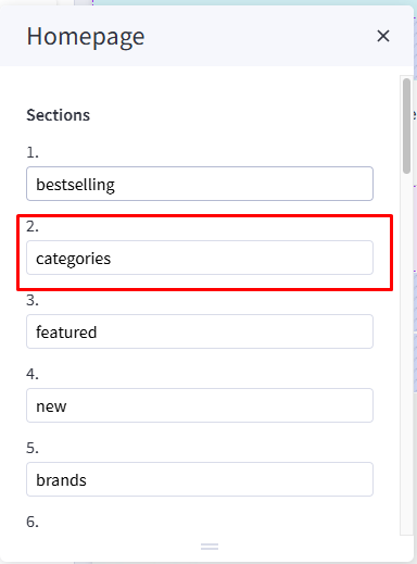
Shop By Category
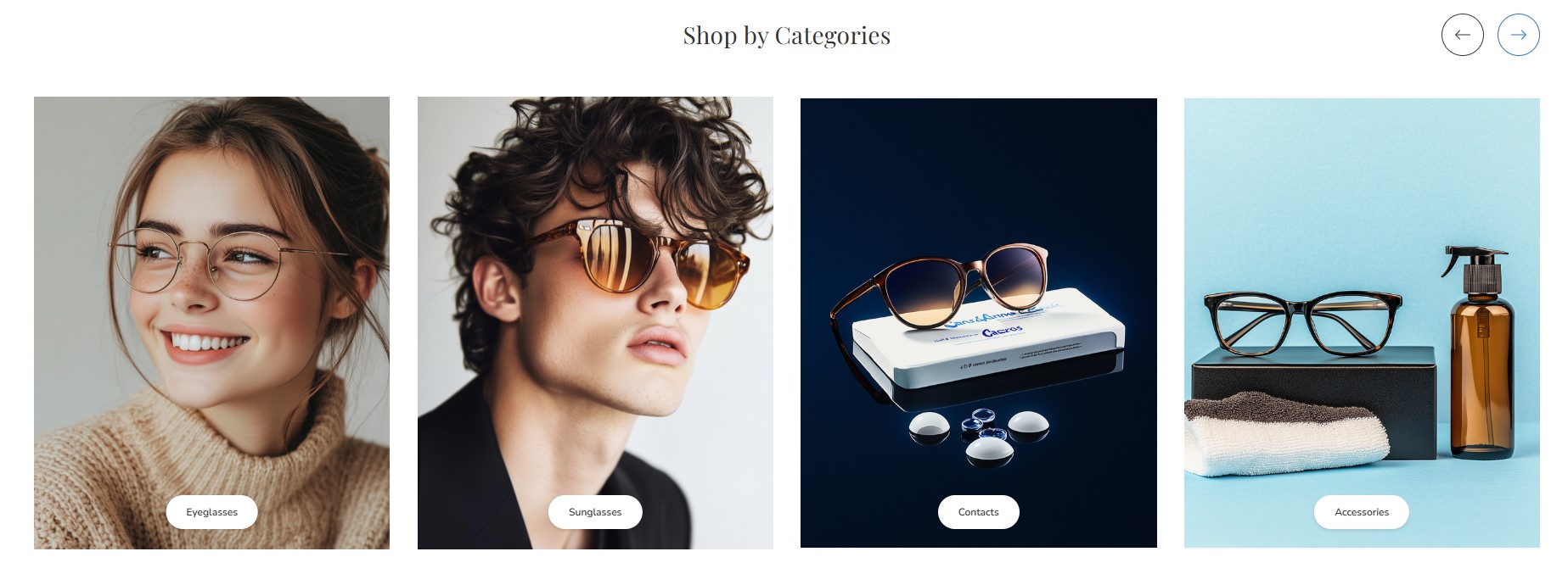
To display this block, navigate to Theme Styles > Home Page > Sections and enter categories into one of the section inputs.
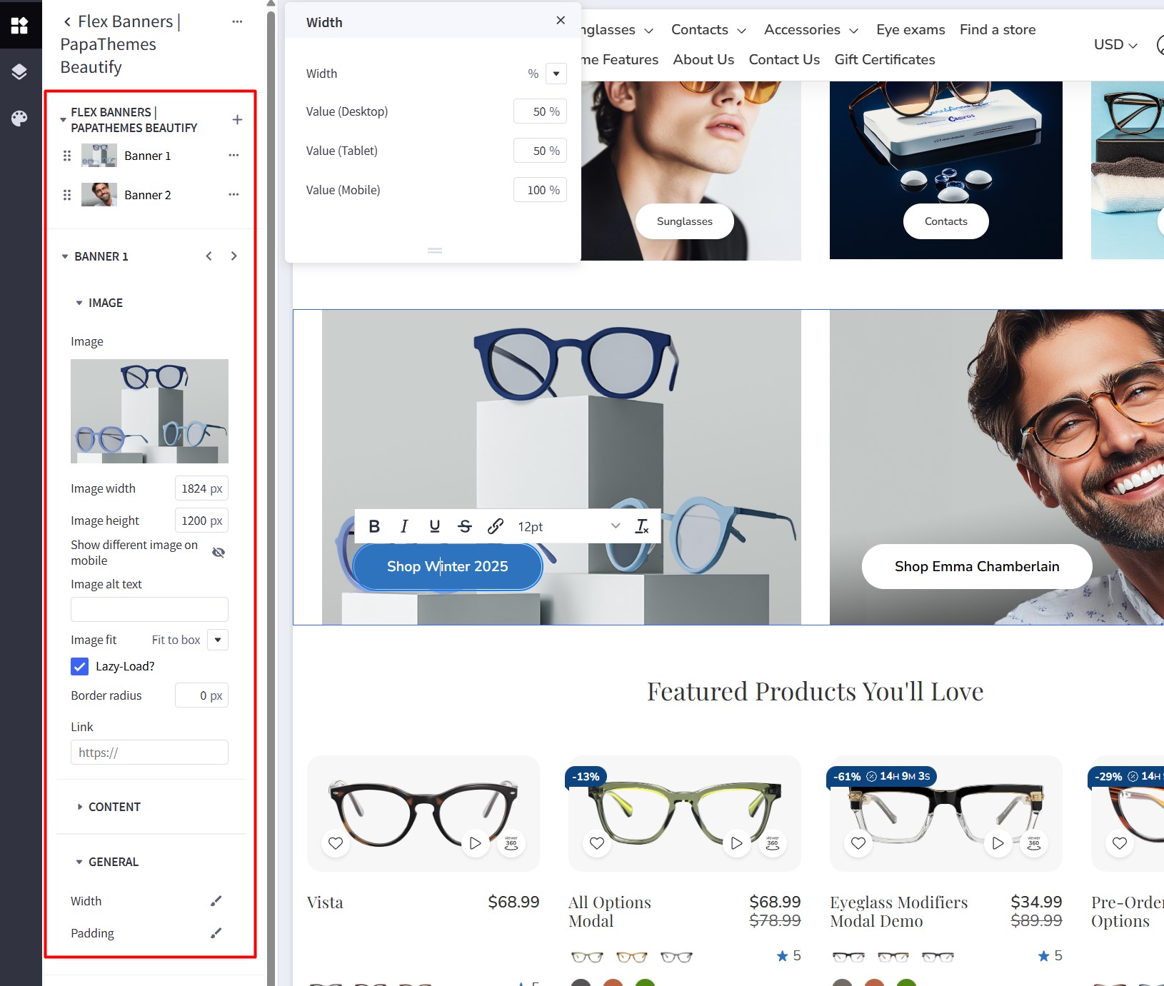
2 Banners: Shop Winter & Shop Emma
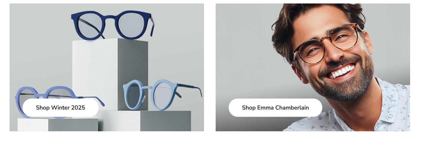
Drag and drop the Flex Banners | PapaThemes Beautify widget into the corresponding widget region.
Click on Banner 1 and configure the widget options as follows:
| Setting | Value |
|---|---|
| Banner 1 → Image | |
| Image | (upload your image) |
| Image width | 1824 px |
| Image height | 1200 px |
| Show different image on mobile | (off - no need) |
| Image alt text | image alt text |
| Image fit | Fit to box |
| Lazy-Load | Checked (ON) |
| Border radius | 0 px |
| Link | (put your link) |
| Content | |
| Heading text | “Shop Winter 2025” (WYSIWYG inline editor) |
| General | |
| Width (Desktop) | 50% |
| Width (Tablet) | 50% |
| Width (Mobile) | 100% |
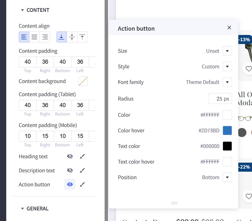
Settings for Action button:
| Setting | Value |
|---|---|
| Size | Unset |
| Style | Custom |
| Font family | Theme Default |
| Radius | 25 px |
| Color | #FFFFFF |
| Color hover | #2D73BD |
| Text color | #000000 |
| Text color hover | #FFFFFF |
| Position | Bottom |
Settings for Width:
| Setting | Value |
|---|---|
| Width | % |
| Value (Desktop) | 50% |
| Value (Tablet) | 50% |
| Value (Mobile) | 100% |
Settings for Padding:
| Device | Top | Right | Bottom | Left |
|---|---|---|---|---|
| Desktop | 0 | 16 | 0 | 0 |
| Tablet | 0 | 8 | 0 | 0 |
| Mobile | 0 | 0 | 8 | 0 |
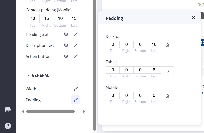
Repeat the same steps for Banner 2, but configure the Width option as follows:
Settings for Padding:
| Device | Top | Right | Bottom | Left |
|---|---|---|---|---|
| Desktop | 0 | 0 | 0 | 16 |
| Tablet | 0 | 0 | 0 | 8 |
| Mobile | 8 | 0 | 0 | 0 |
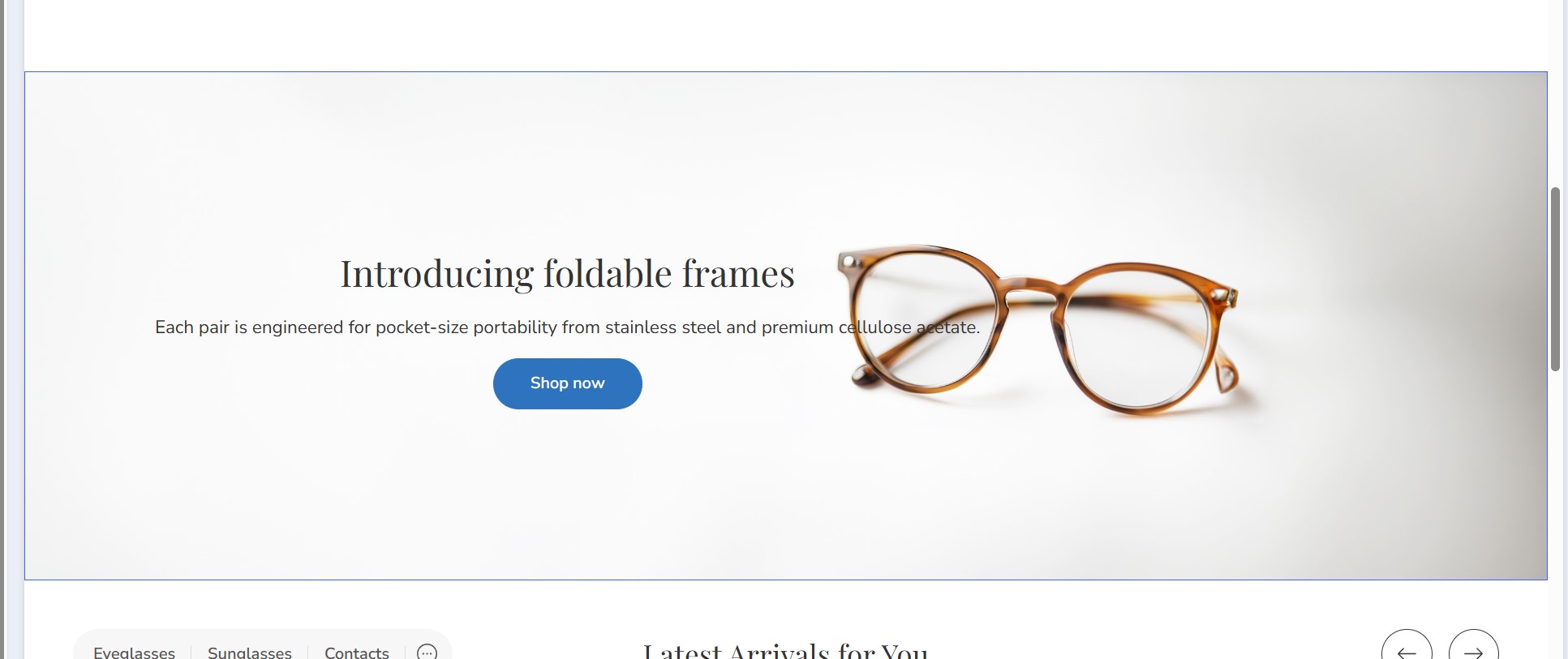
Banner: Introducing foldable frames
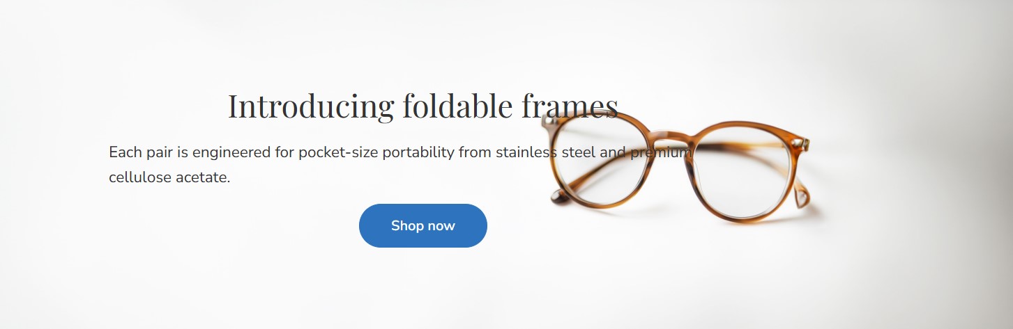
Drag and drop the Flex Banners | PapaThemes Beautify widget into the corresponding widget region. Remove any other banners, keeping only one, and configure its options as follows:
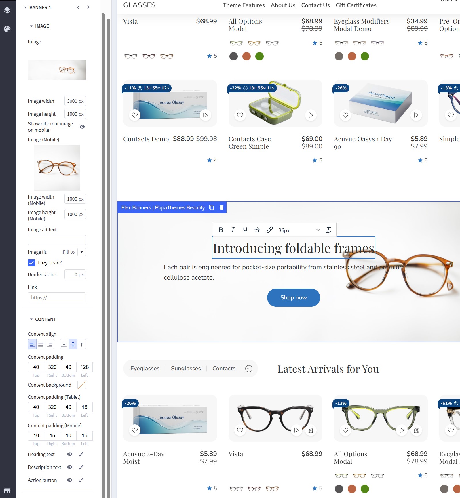
Below is a single table summarizing the Banner 1 settings (Flex Banners | PapaThemes Beautify) as shown in the screenshot. This includes the Image section, the Content section, and any General settings visible:
| Section | Setting | Value |
|---|---|---|
| Image | Image | (upload your image for desktop) |
| Image width | 3000 px | |
| Image height | 1000 px | |
| Show different image on mobile | ON | |
| Image (Mobile) | (upload your image for mobile) | |
| Image width (Mobile) | 1000 px | |
| Image height (Mobile) | 1000 px | |
| Image alt text | image alt text |
|
| Image fit | Fill to box | |
| Lazy-Load | Checked (ON) | |
| Border radius | 0 px | |
| Link | (put your link) | |
| Content | ||
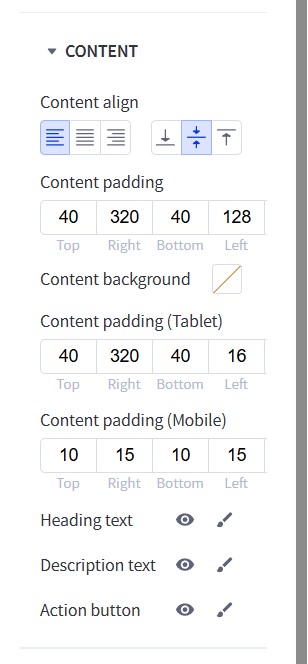
| Content padding (Desktop) | Top: 40 Right: 320 Bottom: 40 Left: 128 |
|
| Content background | (transparent) | |
| Content padding (Tablet) | Top: 40 Right: 320 Bottom: 40 Left: 16 |
|
| Content padding (Mobile) | Top: 10 Right: 15 Bottom: 10 Left: 15 |
|
| Heading text | “Introducing foldable frames” (36px in the WYSIWYG inline editor) | |
| Description text | “Each pair is engineered …” | |
| Action button | “Shop now” |
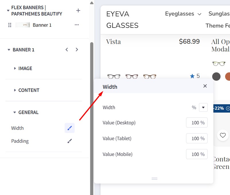
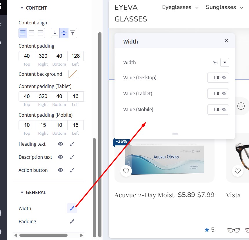
Width settings:
| Setting | Value |
|---|---|
| Width | % |
| Value (Desktop) | 100% |
| Value (Tablet) | 100% |
| Value (Mobile) | 100% |
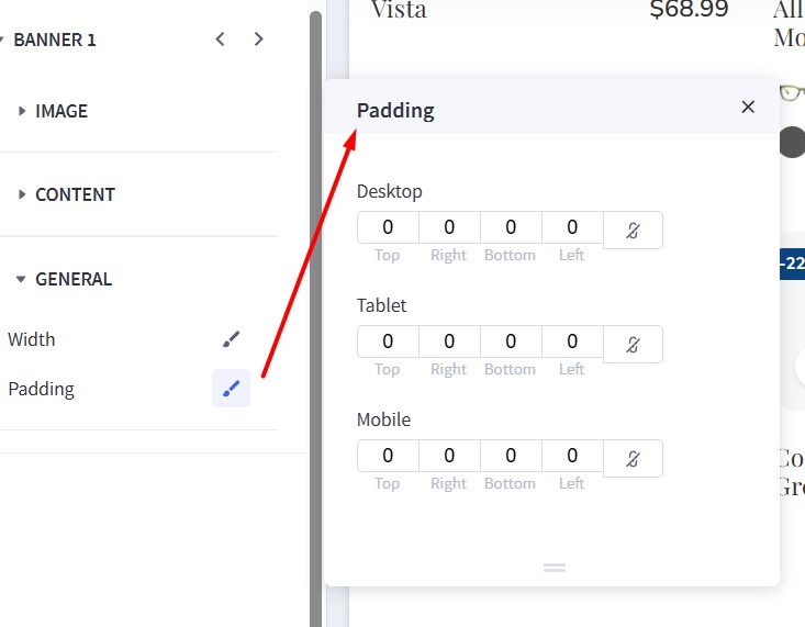
Padding settings:
| Device | Top | Right | Bottom | Left |
|---|---|---|---|---|
| Desktop | 0 | 0 | 0 | 0 |
| Tablet | 0 | 0 | 0 | 0 |
| Mobile | 0 | 0 | 0 | 0 |
Banner: Take 15% off two or more prescription pairs
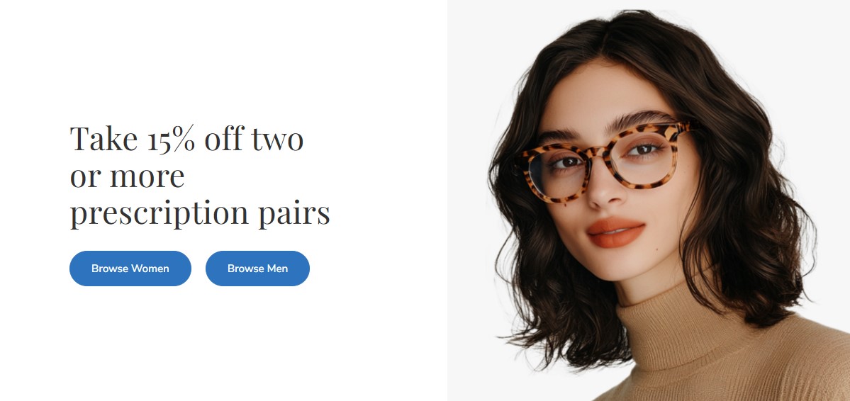
Set up this banner similarly to the "Pick 5 pairs" banner. See the instructions above: Banner: Pick 5 pairs from our Home Try-On collection.
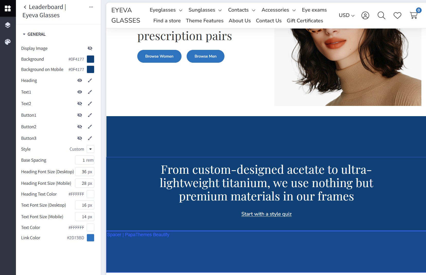
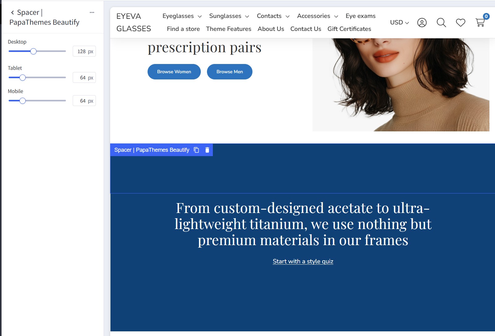
Banner: From custom-designed acetate to ultra-lightweight titanium
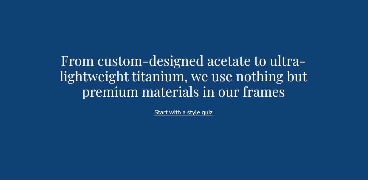
Drag and drop the Leaderboard | Eyeva Glasses widget into the corresponding widget region. Configure the widget options as follows:
| Setting | Value |
|---|---|
| Display Image | (OFF) |
| Background | #0F4177 |
| Background on Mobile | #0F4177 |
| Heading | Visible |
| Text1 | Visible |
| Text2 | Visible |
| Button1 | (OFF) |
| Button2 | (OFF) |
| Button3 | (OFF) |
| Style | Custom |
| Base Spacing | 1 rem |
| Heading Font Size (Desktop) | 36 px |
| Heading Font Size (Mobile) | 28 px |
| Heading Text Color | #FFFFFF |
| Text Font Size (Desktop) | 16 px |
| Text Font Size (Mobile) | 14 px |
| Text Color | #FFFFFF |
| Link Color | #2D73BD |
Then, add two spacer widgets (Spacer | PapaThemes Beautify) above and below the Leaderboard widget. Configure the spacer options as follows:
| Device | Spacing |
|---|---|
| Desktop | 128 px |
| Tablet | 64 px |
| Mobile | 64 px |
Next, in the Layers panel, select the Layout containing the Leaderboard widget and the two Spacer widgets. Update the background color to #0F4177:
Banner: Get 20% off your first contacts order
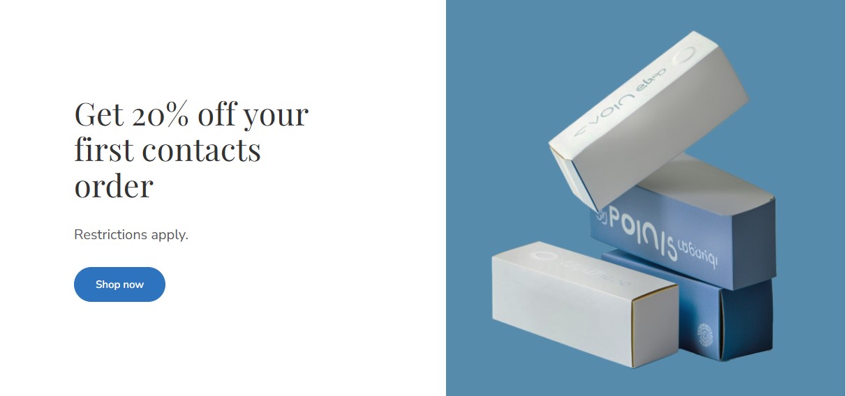
Set up this banner similarly to the "Pick 5 pairs" banner. See the instructions above: Banner: Pick 5 pairs from our Home Try-On collection.
Banner: For every pair purchased
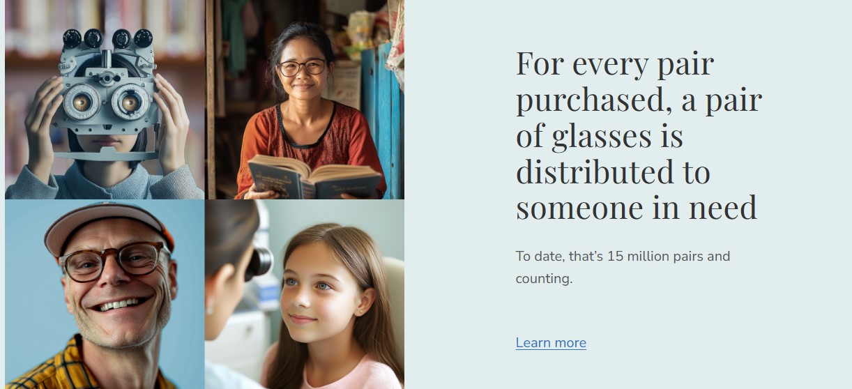
Set up this banner similarly to the "Pick 5 pairs" banner. See the instructions above: Banner: Pick 5 pairs from our Home Try-On collection.
Configure the widget options as follows:
| Setting | Value |
|---|---|
| Display Image | ON |
| Image | (upload your image) |
| Image Alt | image alt text |
| Image Width | 700 px |
| Image Height | 700 px |
| Image (mobile) (optional) | (Not selected) |
| Mobile Image Width | 1500 px |
| Mobile Image Height | 1500 px |
| Content Direction | Image - [Text] |
| Content Direction (mobile) | Image - [Text] |
| Background | #E2EDEE |
| Background on Mobile | #E2EDEE |
| Heading | ON |
| Text1 | ON |
| Text2 | ON |
| Button1 | OFF |
| Button2 | OFF |
| Button3 | OFF |
| Style | Inherit theme |
Bestselling Products
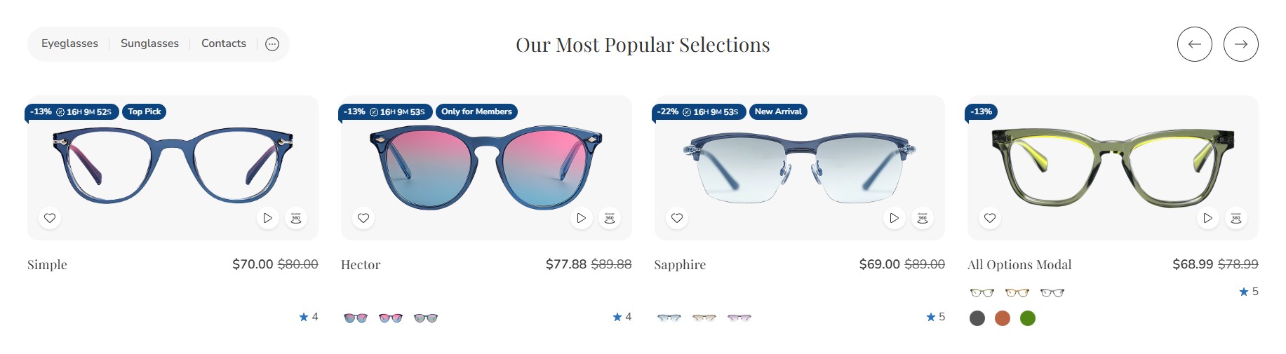
Bestselling products will only appear once your store has received orders.
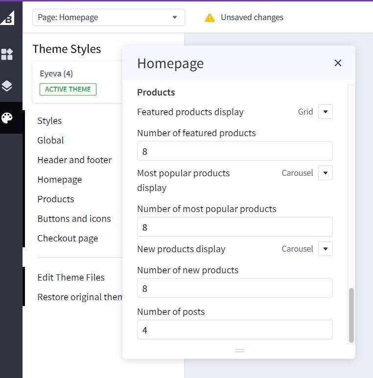
You can configure the bestselling products section settings in Page Builder > Theme Styles > Home Page. Ensure that one of the Sections inputs is set to bestselling. In the Products section, you can adjust the Number of most popular products to display and change the Most popular products display to either Carousel or Grid.
Featured Products
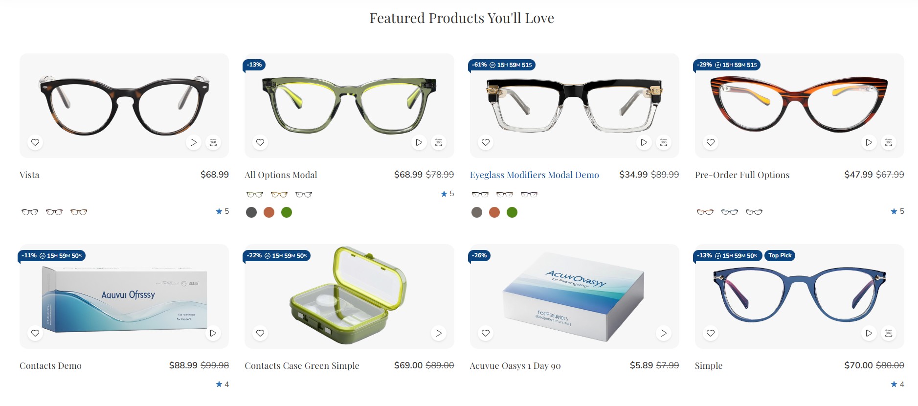
You can designate products as "featured" in Products by clicking the star icon on the corresponding row.
Return to Page Builder > Theme Styles > Home Page and ensure that one of the Sections inputs is set to featured_products. In the Products section, you can modify the Number of featured products to display and change the Featured products display to either Carousel or Grid.
New Products
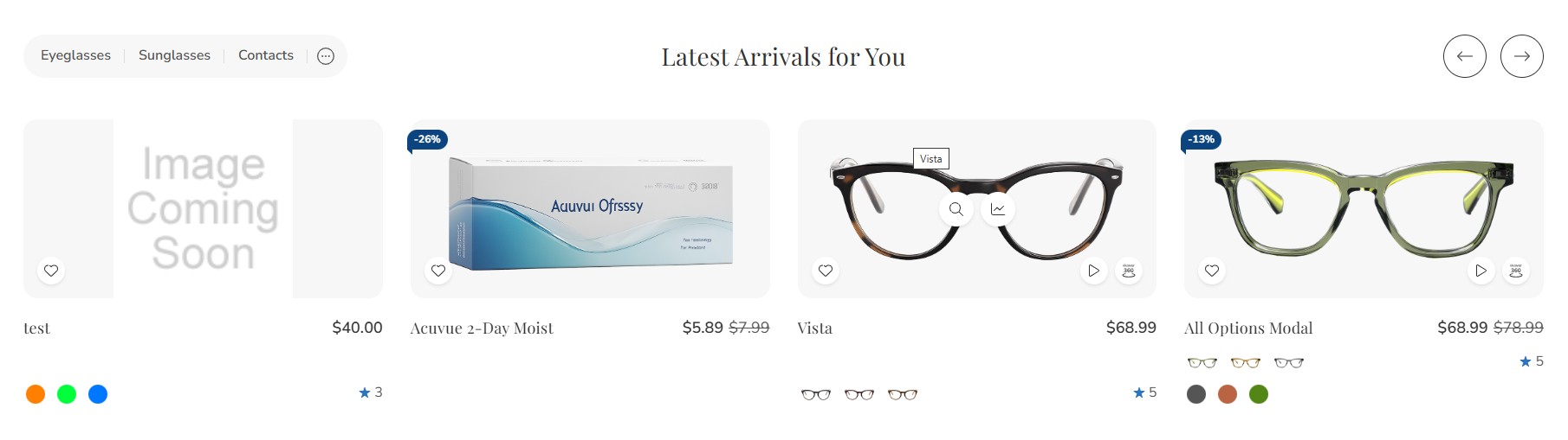
You can configure the new products section settings in Page Builder > Theme Styles > Home Page. Ensure that one of the Sections inputs is set to new. In the Products section, you can change the Number of new products to display and change the New products display to either Carousel or Grid.
Wide banner
In Page Builder, drag & drop the Flex Banner widget into the corresponding widget region:
Configure the widget options as follows:
 |
 |
 |
| Setting | Value |
|---|---|
| Image | |
| Image | (Eyeglasses image) |
| Image width | 3000 px |
| Image height | 1000 px |
| Show different image on mobile | ON (toggle enabled) |
| Image (Mobile) | (Alternate eyeglasses image) |
| Image width (Mobile) | 1000 px |
| Image height (Mobile) | 1000 px |
| Image alt text | (blank) |
| Image fit | Fill to box |
| Lazy-Load | ON (toggle enabled) |
| Border radius | 0 px |
| Link | (blank) |
| Content | |
| Content align (Horizontal) | Left |
| Content align (Vertical) | Center |
| Content padding (Desktop) | Top: 40 px • Right: 320 px • Bottom: 40 px • Left: 128 px |
| Content padding (Tablet) | Top: 40 px • Right: 320 px • Bottom: 40 px • Left: 16 px |
| Content padding (Mobile) | Top: 10 px • Right: 15 px • Bottom: 10 px • Left: 15 px |
| Content background | (none) |
| Heading text | Visible (eye icon ON) |
| Description text | Visible (eye icon ON) |
| Action button | Visible (eye icon ON) |
| General | |
| Width (Desktop) | 100% |
| Width (Tablet) | 100% |
| Width (Mobile) | 100% |
| Padding | (not shown, likely 0) |
Recently Viewed Products
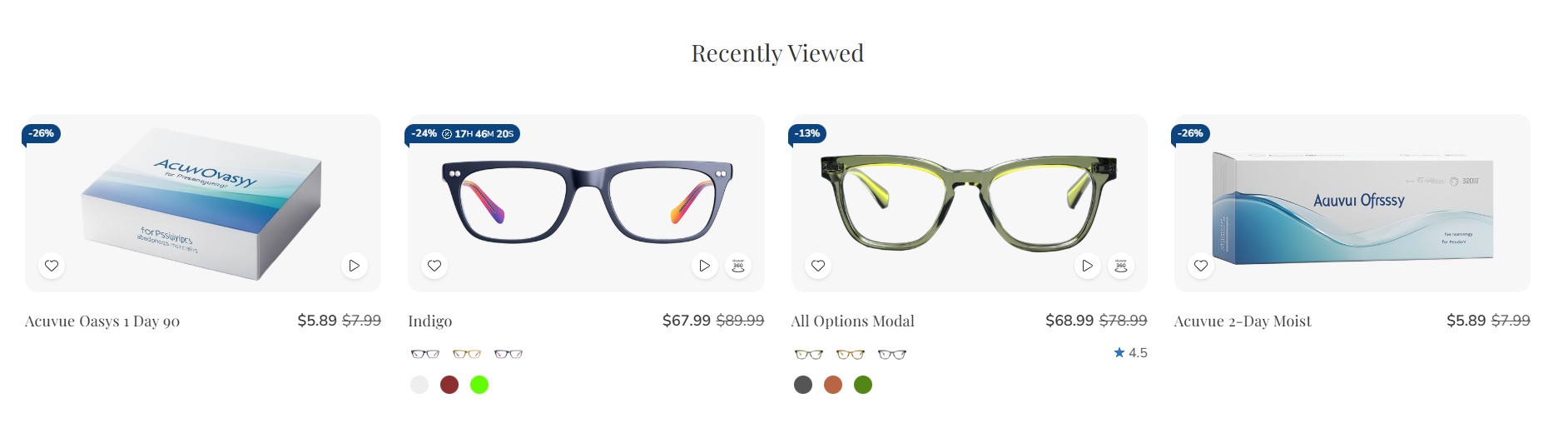
Recently Viewed Products will be displayed automatically after a product has been viewed.
You can configure the Recently Viewed Products section settings in Page Builder > Theme Styles > Home Page. Ensure that one of the Sections inputs is set to viewed to enable this block.
Configure product columns on desktop, tablet, and mobile
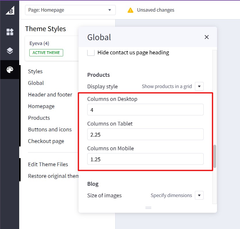
To change the number of products displayed per row, go to Page Builder > Global > Product.
- Columns on Desktop: Specify the number of product columns to display on Desktop.
- Columns on Tablet: Specify the number of product columns to display on Tablet.
- Columns on Mobile: Specify the number of product columns to display on Mobile.
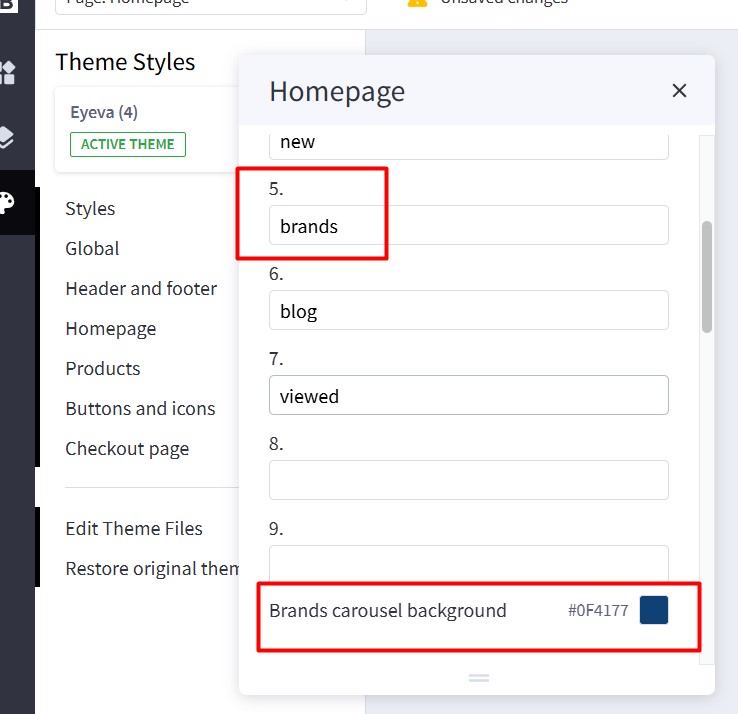
Featured Brands
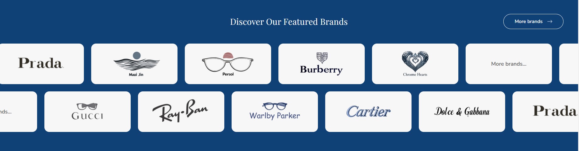
The Featured Brands section will automatically display all brands from your store.
To enable the Featured Brands section, in Theme Styles > Home Page > Sections, choose one of the sections and type brands to enable this block.
To change the background color of this section, click on Brands carousel background and select a color that fits your design.
Recent Blog Posts
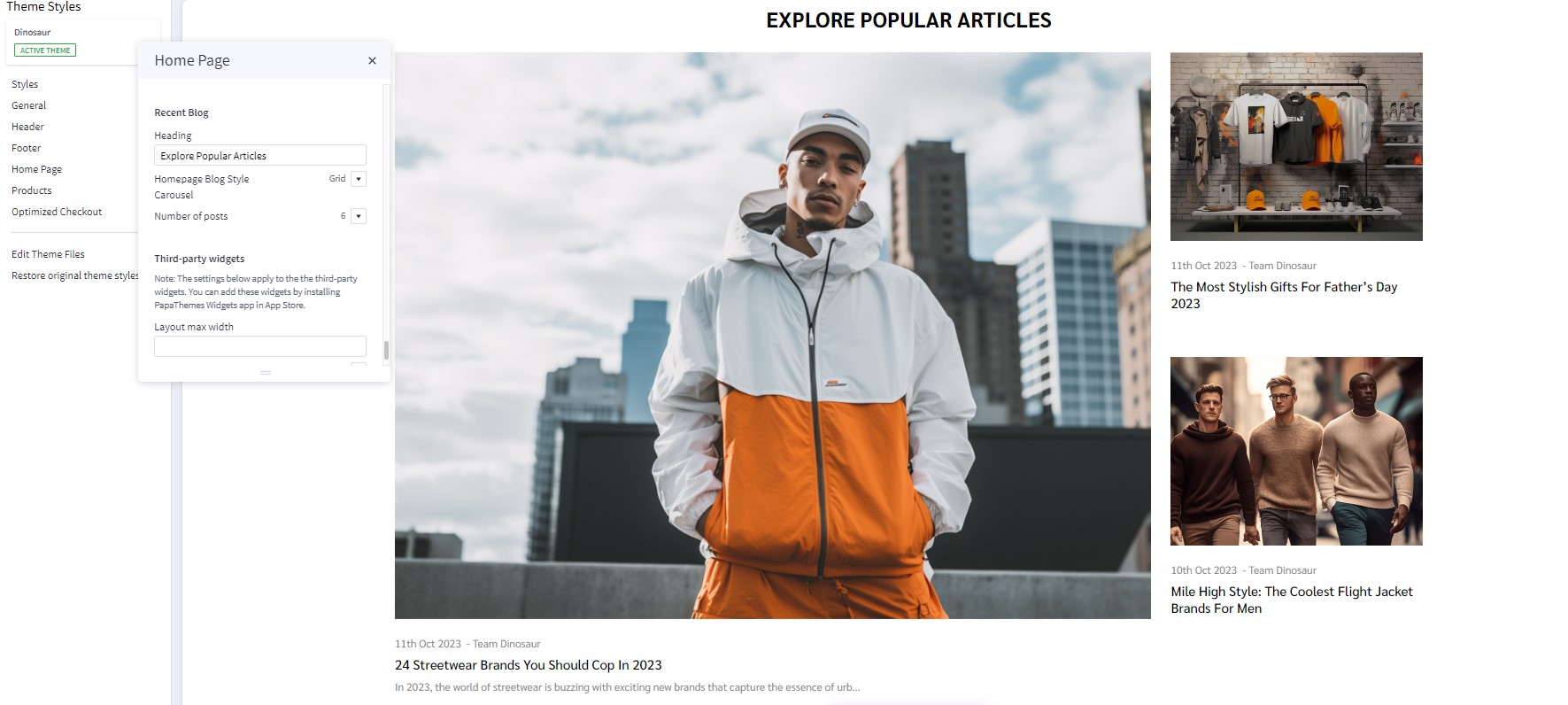
You can add blog posts in Storefront > Blog. Click the + button to add a new blog post. Make sure Blog Visibility is on.
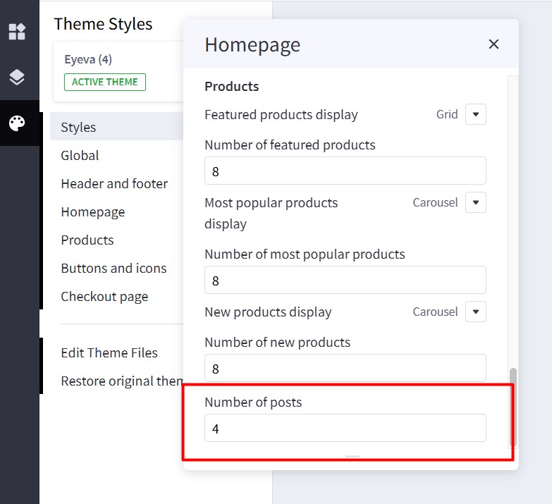
To display the recent blog posts on the home page, go to Page Builder. In Theme Styles > Home Page, make sure one of Sections has typed blog. Scroll down the Recent Blog section, you can configure Heading, Number of posts to display.
Footer
Configure footer settings in Theme Styles > Header and footer > Footer.
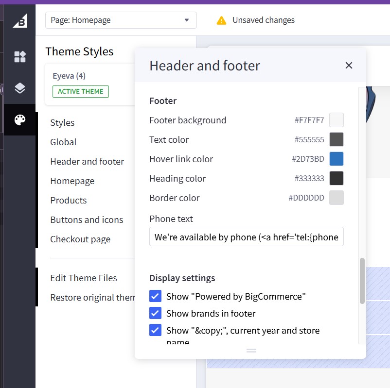
| Setting | Meaning |
|---|---|
| Footer background | The background color for the store’s footer area. |
| Text color | The primary text color used throughout the footer. |
| Hover link color | The color applied to footer links when hovered over by the mouse. |
| Heading color | The color for any heading text within the footer (e.g. “Contact Us,” “Information,” etc.). |
| Border color | The color of any borders or dividing lines in the footer. |
| Phone text | The text snippet (including an HTML link) displayed for phone contact in the footer. |
| Show “Powered by BigCommerce” | Toggles the visibility of the “Powered by BigCommerce” credit at the footer’s bottom. |
| Show brands in footer | Determines if brand logos/links are displayed in the footer. |
| Show “©”, current year and store name | Toggles the display of a copyright notice showing “© [current year] [store name].” |
Phone text allows you to change the text, along with the phone number, in the input field based on the text below.
{phone} will be replaced by the phone number you set in the store settings.
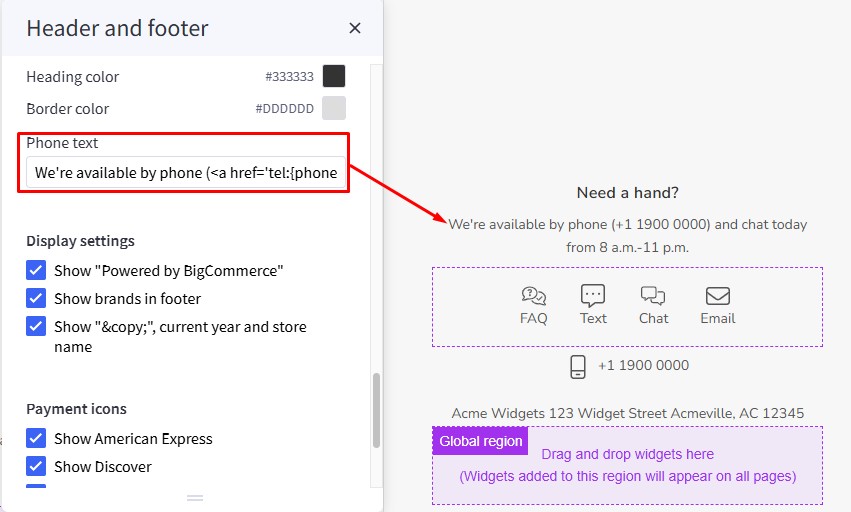
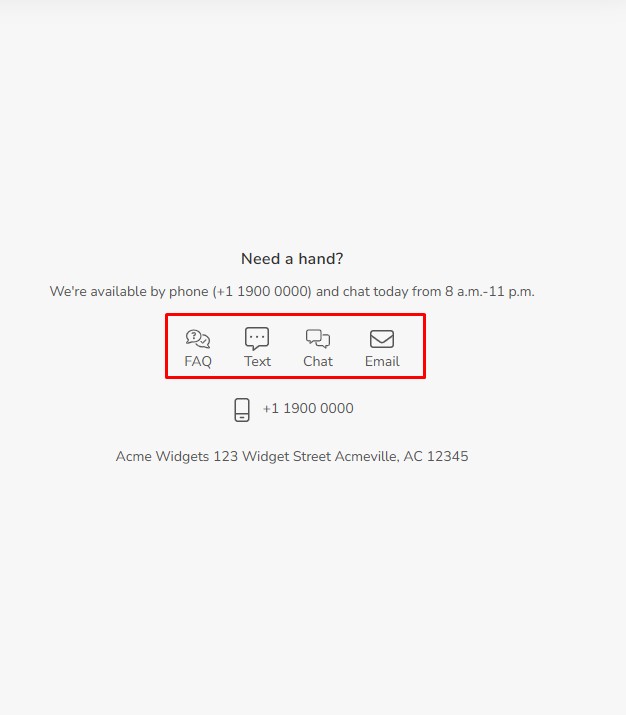
You can display contact icons (FAQ, Text, Chat, Email) using a widget. Drag and drop the HTML widget into the corresponding widget region, then copy the HTML code below and click the Save HTML button.
<ul class="footer-contacts-callouts">
  <li><a href="/faq"><i class="icon" aria-hidden="true"><svg><use href="#icon-comments-question-check"></use></svg></i>FAQ</a></li>
  <li><a href="#text-message"><i class="icon" aria-hidden="true"><svg><use href="#icon-message-dots"></use></svg></i>Text</a></li>
  <li><a href="#chat"><i class="icon" aria-hidden="true"><svg><use href="#icon-messages"></use></svg></i>Chat</a></li>
  <li><a href="mailto:contact@papathemes.com"><i class="icon" aria-hidden="true"><svg><use href="#icon-envelope"></use></svg></i>Email</a></li>
</ul>
Payment Icons allows you to select which payment icons to display.
Custom Footer Links
Add custom links to the footer by using the HTML widget. Simply drag and drop it into the appropriate widget region:
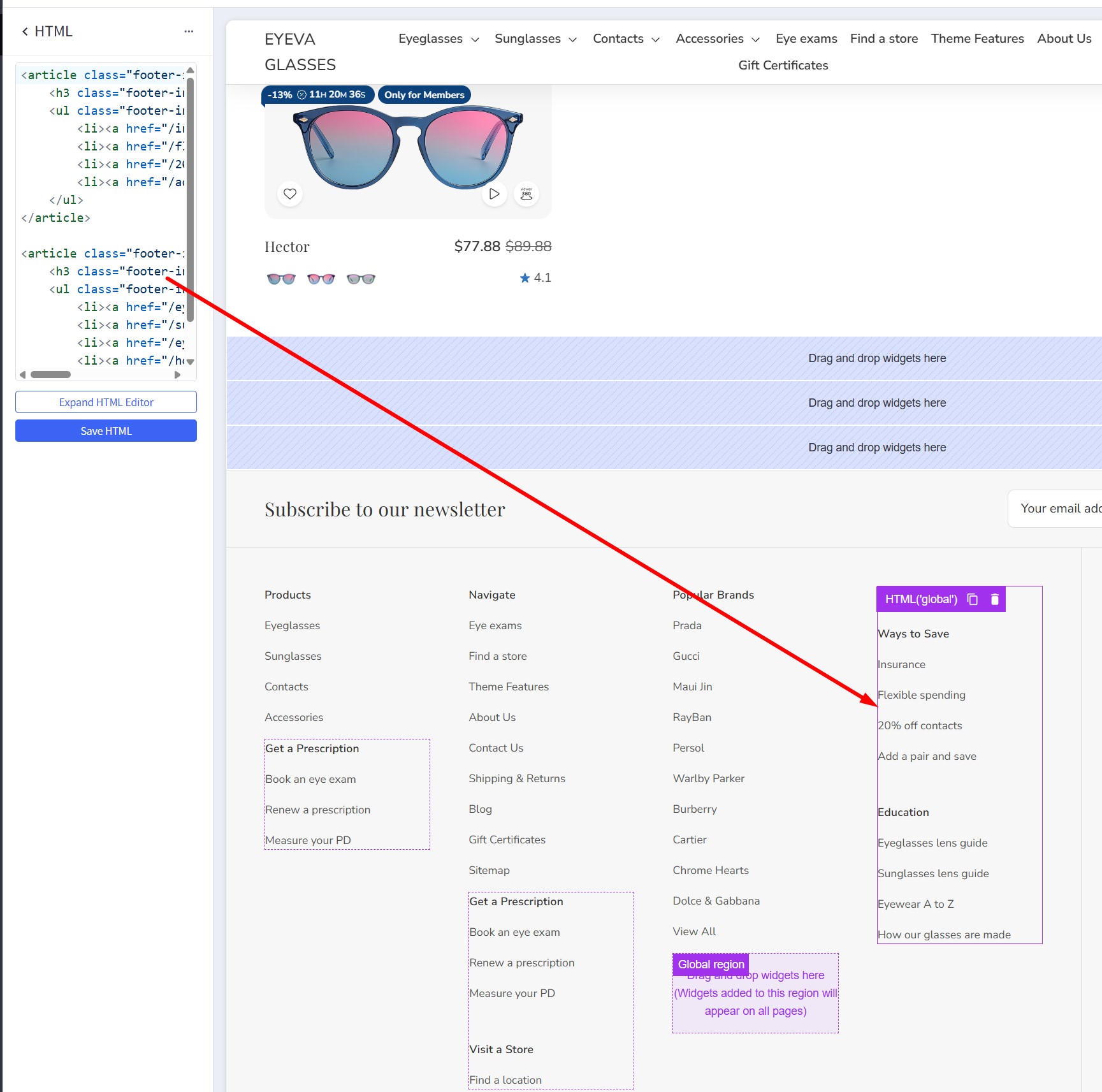
Paste the following code into the HTML editor, and then click the Save HTML button:
<article class="footer-info-col">
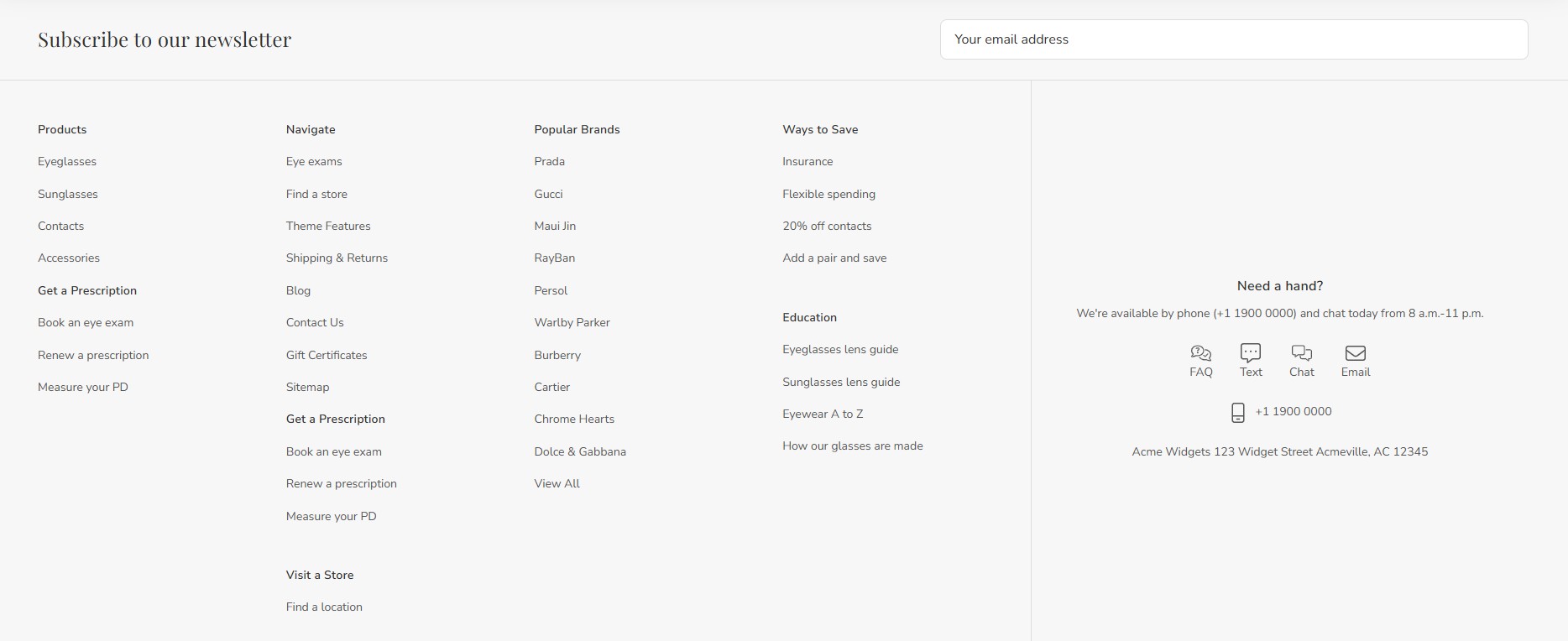
<h3 class="footer-info-heading">Ways to Save</h3>
<ul class="footer-info-list">
<li><a href="/insurance/">Insurance</a></li>
<li><a href="/flexible-spending/">Flexible spending</a></li>
<li><a href="/20-off-contacts/">20% off contacts</a></li>
<li><a href="/add-a-pair-and-save/">Add a pair and save</a></li>
</ul>
</article>
<article class="footer-info-col">
<h3 class="footer-info-heading">Education</h3>
<ul class="footer-info-list">
<li><a href="/eyeglasses-lens-guide/">Eyeglasses lens guide</a></li>
<li><a href="/sunglasses-lens-guide/">Sunglasses lens guide</a></li>
<li><a href="/eyewear-a-to-z/">Eyewear A to Z</a></li>
<li><a href="/how-our-glasses-are-made/">How our glasses are made</a></li>
</ul>
</article>